 Sheet2Chart
Sales Dashboard Guide: KPIs, Charts, and Spreadsheet Setup
A well-designed sales dashboard separates outcomes (revenue, bookings, quota attainment) from forward-looking signals (pipeline coverage, stage conversion) and operational exceptions (stalled deals, overdue follow-ups) — and it can be built entirely from an Excel or Google Sheets export. This guide covers every KPI, chart type, and spreadsheet field a sales dashboard needs, from the executive summary down to record-level action.
1. Introduction
A sales dashboard should do more than display totals. It should tell a decision-maker whether the business is on plan, why performance is changing, what is likely to happen next, and where action is required.
That requires a deliberate separation between:
- Outcomes: revenue, bookings, margin, quota attainment, growth, retention.
- Forward-looking signals: qualified pipeline coverage, pipeline creation, stage conversion, deal movement, response time, stage age, and forecast.
- Operational exceptions: stalled deals, overdue follow-ups, pushed close dates, inactive opportunities, renewal risk, and data-quality failures.
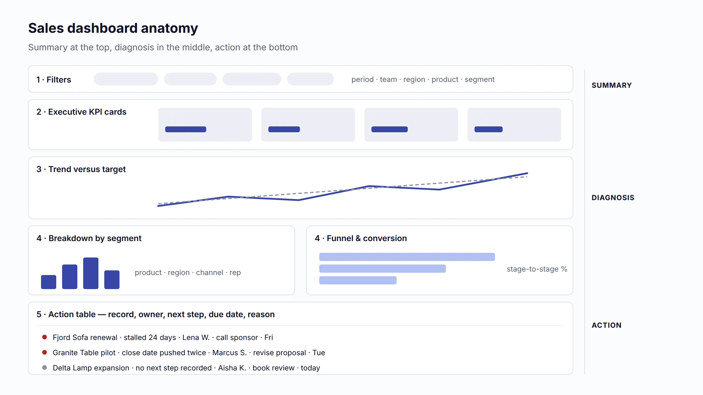
Established CRM and revenue-operations sources converge on the same principle: dashboard design must begin with the audience, its decisions, and the necessary refresh cadence. An executive dashboard should emphasize business impact rather than activity volume [1][2]. Sales managers need the diagnostic layer beneath the summary, while representatives need the underlying accounts, opportunities, and tasks.
This guide assumes the reader is starting from Excel or Google Sheets. It therefore distinguishes metrics that can be calculated from a single current-state table from metrics that require historical snapshots, stage-change records, activities, targets, costs, subscriptions, or customer-level transactions.
First decide what “sales” means
Before building any chart, define the value being reported. These measures are related but not interchangeable:
- Orders or gross sales: transaction value before returns, discounts, or cancellations, depending on policy.
- Net sales: sales after defined deductions such as returns and discounts.
- Bookings: signed or committed contract value. Bookings indicate future commercial commitments, not necessarily recognized revenue.
- Closed-won opportunity value: the amount credited by the sales process when a deal closes. It may be bookings, annual contract value, total contract value, or another sales-credit amount.
- Recognized revenue: revenue recorded when or as the promised goods or services are transferred. Under IFRS 15, recognition follows satisfaction of performance obligations, so a signed annual contract is not automatically one month of recognized revenue [17].
- Cash collected: payment received. Cash timing can differ from both bookings and revenue.
- Recurring revenue: normalized subscription revenue such as MRR or ARR, excluding one-time services when that is the company policy [7].
Every dashboard title, KPI label, formula, and target must use the same definition. “Revenue” is too ambiguous if the source spreadsheet actually contains bookings or invoiced amounts.
Assumptions used in this guide
- A reporting period is a consistently defined week, month, quarter, or year in one business timezone.
- An opportunity is a qualified commercial pursuit, not every lead or contact.
- A won deal is counted once using a stable Opportunity ID or Order ID.
- Rates use a clearly defined cohort or outcome population. Open opportunities are not silently included in a win-rate denominator.
- Monetary metrics are converted to a single reporting currency before aggregation, unless the dashboard is explicitly filtered to one currency.
- Targets and actuals use the same crediting basis, period, owner hierarchy, and revenue definition.
- Benchmarks are starting points only. The company’s observed history by segment is more reliable than a generic target.
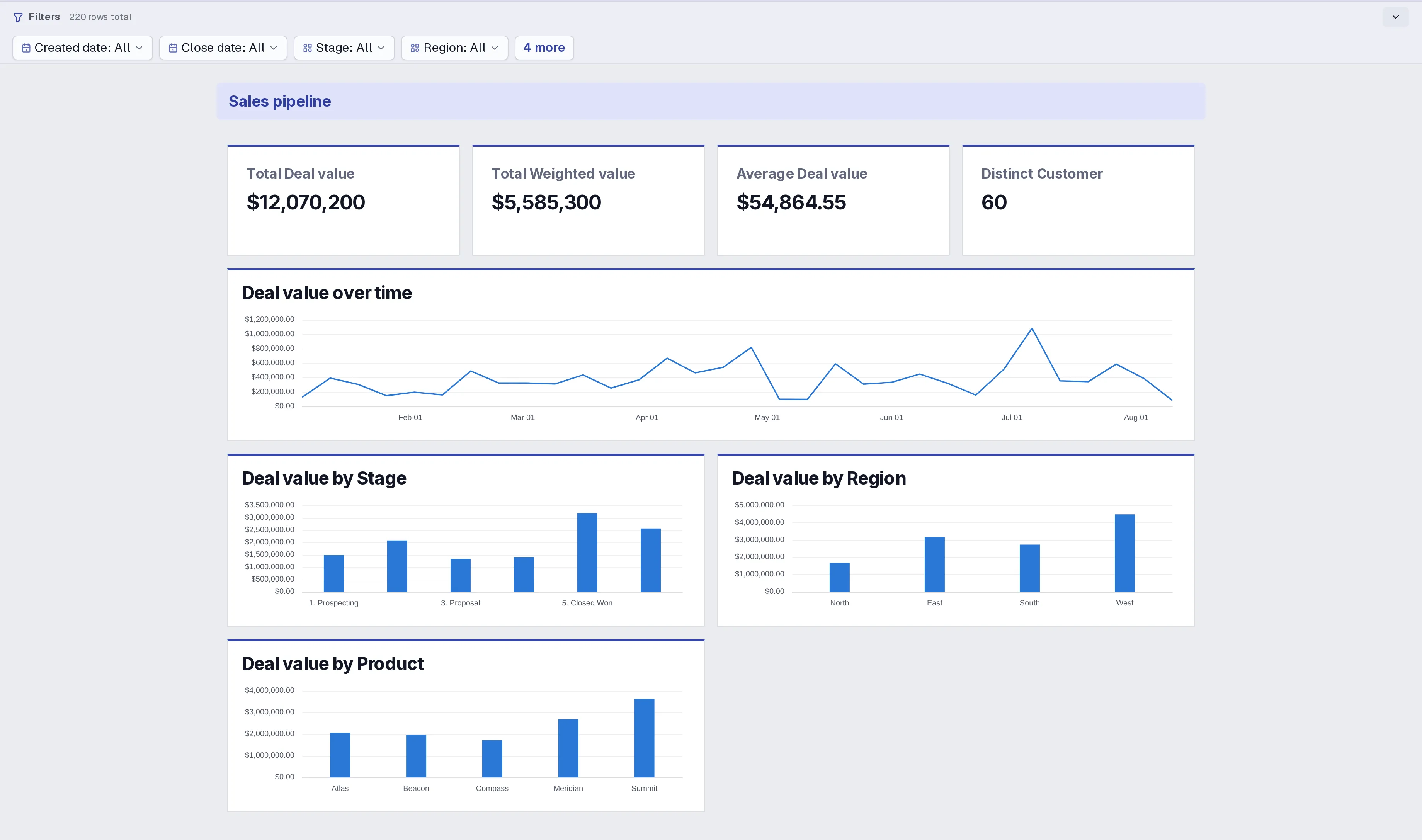
Everything in this guide is grounded in one worked example: a sample sales pipeline workbook (.xlsx) (58 KB) that implements the exact spreadsheet schema defined in section 11, and an interactive example dashboard built from it that you can open and filter by stage, region, owner, or date — no account needed.
2. What a sales dashboard should help users understand
A dashboard is useful only when each section answers a decision question.
The ten questions
- Are we on plan? Compare actual sales, bookings, margin, and quota attainment with target and prior periods.
- What changed? Show growth, variance, mix shifts, pipeline movement, and the components that explain the change.
- Where is performance coming from? Break results down by product, region, channel, segment, customer, and representative.
- Do we have enough qualified demand to hit the next target? Measure pipeline coverage, creation, quality, age, and conversion.
- Where does the funnel leak? Compare cohorts and stage transitions, not merely the current number of records in each stage.
- What is likely to close? Show forecast categories, weighted pipeline, close-date distribution, deal health, and forecast history.
- Is the team executing effectively? Connect activity and follow-up behavior to opportunities, conversion, cycle time, and outcomes.
- Are customers becoming more valuable or less valuable? Track retention, churn, renewal, repeat purchase, expansion, and customer cohorts where the business model supports them.
- What is risky or concentrated? Surface stale deals, pushed deals, overdue next steps, low coverage, customer concentration, and at-risk renewals.
- What action should happen next? End diagnostic views with a filtered record table that identifies the account, owner, next step, due date, and reason for attention.
KPI classification
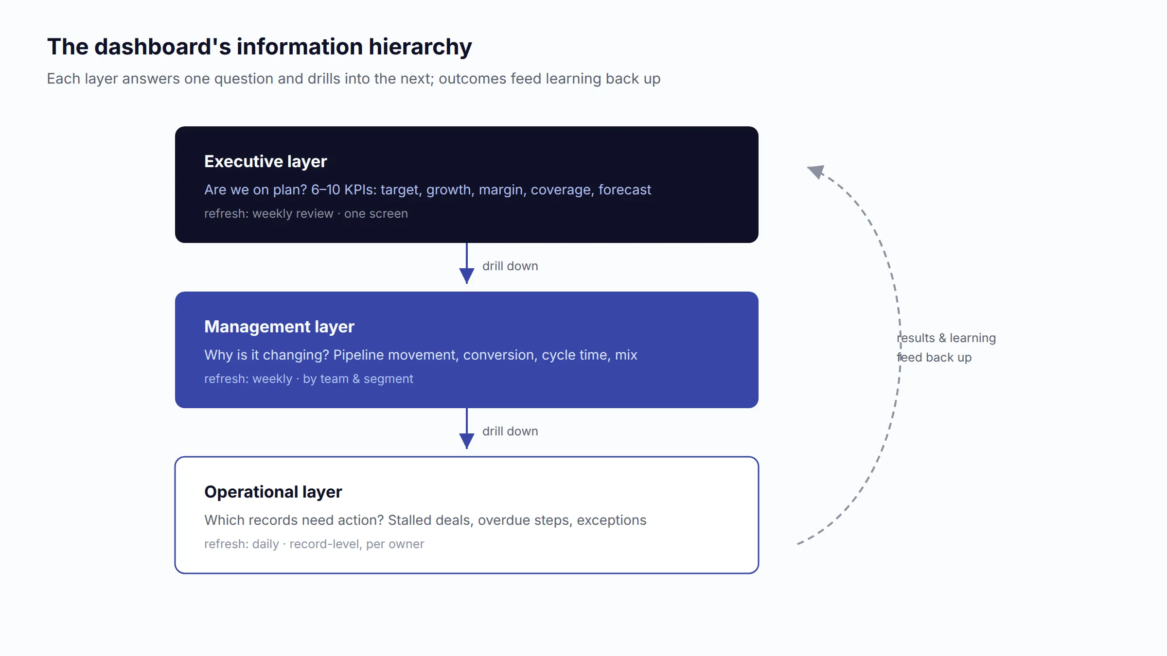
Executive KPIs
Keep this layer to roughly six to ten measures. It communicates overall health and should fit in one screen: actual versus target, growth, margin, quota attainment, forecast, qualified pipeline coverage, win rate, and a retention measure when relevant.
Management KPIs
This layer explains the executive result. It includes pipeline creation and movement, conversion by stage, sales cycle, forecast accuracy and bias, attainment distribution, product and segment mix, renewal performance, and deal risk.
Operational KPIs
This layer directs daily and weekly work. It includes lead response time, activity completion, next-step coverage, time in stage, inactive deals, overdue proposals, upcoming renewals, and exception lists.
One metric can appear at more than one layer, but the presentation must change. Executives see total quota attainment and forecast risk. Managers see the distribution by team and segment. A representative sees personal gap-to-goal, open opportunities, and required actions.
Leading, lagging, and diagnostic indicators
- Lagging indicators confirm completed outcomes: recognized revenue, closed-won bookings, gross margin, churn, and quota attainment.
- Leading indicators indicate likely future outcomes: qualified pipeline coverage, pipeline creation, response time, stage progression, renewal coverage, and next-step completion.
- Diagnostic indicators explain performance but do not independently predict it: loss reasons, product mix, revenue concentration, stage-age distribution, activity mix, and rep comparisons.
Do not treat the classification as permanent. Pipeline coverage is leading during the quarter but becomes historical evidence after the period closes. Activity volume is leading only when the team has demonstrated that the activity is connected to a meaningful next outcome.
3. Essential executive KPIs
The executive summary should show current value, target or comparison, variance, trend, and status. A large number without context is not an executive KPI.

3.1 Actual sales or bookings versus target
Definition and meaning: The value credited in the reporting period compared with the approved target. It answers whether the business is on plan. Label the measure as bookings, net sales, recognized revenue, or another explicitly governed definition.
Formula: Attainment % = Actual credited value / Target value × 100; Variance = Actual - Target.
Required fields: Transaction or Opportunity ID, status, credited amount, credit/close/revenue date, target amount, target period; Rep ID and hierarchy if targets are assigned by owner.
Frequency and visual: Daily refresh for active sales teams; weekly management review; monthly or quarterly executive review. Use a KPI card with target and prior-period variance, supported by a bullet chart or actual-versus-target column chart.
Filters: Period, team, representative, territory, product, segment, channel, currency.
Warning signs and type: Lagging. A total above target can conceal a weak next-period pipeline, excessive discounting, or dependence on one large deal. Confirm that target and actual use the same period and crediting policy.
3.2 Revenue or bookings growth
Definition and meaning: Change in the chosen sales measure relative to a comparable prior period. It indicates direction and scale, not profitability.
Formula: Growth % = (Current period - Comparable prior period) / Comparable prior period × 100.
Required fields: Amount, reporting date, metric type, currency; enough history for month-over-month, quarter-over-quarter, or year-over-year comparison.
Frequency and visual: Monthly and quarterly. Use a line chart with the current and prior-year series, or a variance column chart. Show the comparison basis in the title.
Filters: Product, region, channel, customer segment, new/existing customer, representative.
Warning signs and type: Lagging. Avoid comparing a partial month with a completed month. Seasonal businesses should emphasize year-over-year and rolling-12-month views. Growth caused entirely by price increases or acquisitions needs a separate explanation.
3.3 Gross margin or contribution margin
Definition and meaning: Gross margin shows revenue remaining after cost of goods sold. Contribution margin subtracts all defined variable costs and shows the amount available to cover fixed costs and profit. These metrics prevent revenue growth from masking deteriorating economics.
Formula: Gross margin % = (Revenue - COGS) / Revenue × 100; Contribution margin % = (Revenue - Variable costs) / Revenue × 100 [10].
Required fields: Revenue, COGS or line-level cost, variable fulfillment, payment, shipping, commission, or service-delivery costs according to the company definition.
Frequency and visual: Monthly and quarterly. Use a KPI card plus a margin trend line; use bars for margin by product, channel, or customer.
Filters: Product, service, channel, region, customer, segment, deal type.
Warning signs and type: Lagging and diagnostic. Do not compare margin across teams unless cost allocation is consistent. Discounts, returns, freight, pass-through revenue, and implementation labor can materially distort the result.
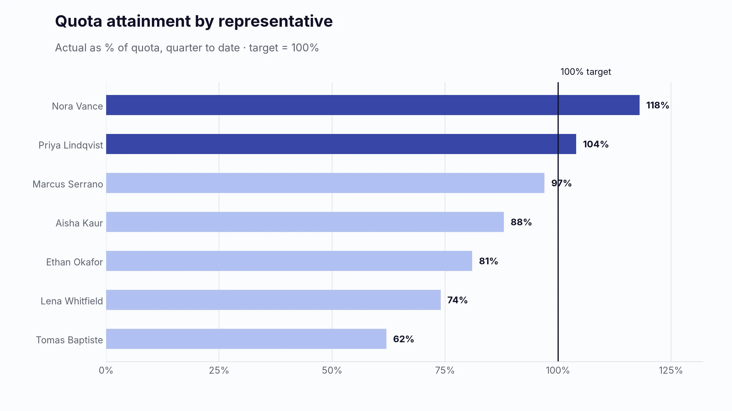
3.4 Quota attainment and attainment distribution
Definition and meaning: The percentage of assigned quota achieved by a representative, team, or territory. The distribution reveals whether performance is broad or dependent on a few sellers.
Formula: Quota attainment % = Credited sales / Assigned quota × 100; team attainment should be Sum credited sales / Sum assigned quota, not the unweighted average of rep percentages.
Required fields: Rep ID, active dates, quota period, quota value, credited sales value, territory/team hierarchy.
Frequency and visual: Weekly during the period; formal monthly or quarterly review. Use a bullet chart for each rep or team and a distribution histogram or ranked bar chart for management.
Filters: Team, manager, role, ramp status, territory, segment, product.
Warning signs and type: Lagging. A healthy team result with a low median or a small share of reps at target signals concentration. Exclude or separately label new hires, leave periods, overlays, split credits, and ramp quotas.
3.5 Qualified pipeline coverage
Definition and meaning: Qualified open opportunity value for a defined close period divided by the target for that same period. It asks whether enough credible pipeline exists to support the goal.
Formula: Coverage = Qualified open pipeline / Period target. A second operational version can use Open pipeline / Remaining target gap; label the basis clearly.
Required fields: Opportunity ID, amount, stage, qualification flag, expected close date, status, target period and amount.
Frequency and visual: Daily or weekly. Use a KPI card with trend and a bullet chart against the internally required coverage ratio.
Filters: Close period, team, rep, segment, product, region, lead source, pipeline type.
Warning signs and type: Leading. Raw pipeline volume is not coverage. Clari explicitly warns that unqualified, stale, or unrealistic opportunities create false confidence and that required coverage should reflect actual win rate rather than a universal 3× rule [4].
3.6 Forecast and forecast accuracy
Definition and meaning: The forecast is the expected credited sales for a future period. Accuracy measures the distance between a forecast captured at a defined cutoff and the final actual result.
Formula: Forecast error % = |Actual - Forecast| / Actual × 100; Accuracy % = max(0, 100% - Error %) [5]. Also show Bias = Forecast - Actual because accuracy alone hides systematic optimism or conservatism.
Required fields: Forecast snapshot date, forecast period, rep/team, forecast category or submitted amount, actual closed value, currency.
Frequency and visual: Weekly forecast snapshot; monthly/quarterly accuracy review. Use a forecast-versus-actual line or paired columns, plus an error trend and bias indicator.
Filters: Forecast cutoff, team, rep, segment, product, forecast category.
Warning signs and type: Forecast is leading; accuracy is lagging and diagnostic. Never calculate historical accuracy from a forecast that has been overwritten. Low-actual periods make percentage error unstable; use absolute error or weighted absolute percentage error across periods.
3.7 Opportunity win rate
Definition and meaning: The share of decided opportunities that were won. It measures outcome efficiency after an opportunity has entered the defined sales process.
Formula: Win rate = Closed-won opportunities / (Closed-won + Closed-lost opportunities) × 100.
Required fields: Opportunity ID, final status, actual close date, amount; qualification or cohort date for cohort-based analysis.
Frequency and visual: Monthly and quarterly. Use a KPI card with a trend line and segmented bars by source, product, segment, or rep.
Filters: Close period, cohort period, segment, product, source, competitor, rep, deal-size band.
Warning signs and type: Lagging and diagnostic. Do not divide wins by all open and closed opportunities. Outcome-period win rate is timely but mix-sensitive; created-cohort win rate is analytically cleaner but requires waiting for the cohort to mature.
3.8 Retention or repeat revenue health
Definition and meaning: For recurring businesses, use net revenue retention or renewal rate. For transactional businesses, use repeat purchase rate or existing-customer revenue share. It asks whether the installed customer base is durable and expanding.
Formula: For subscriptions, NRR = (Starting recurring revenue - Churn - Contraction + Expansion) / Starting recurring revenue × 100 [8]. For transactions, Repeat purchase rate = Customers with a repeat purchase / Eligible customer cohort × 100.
Required fields: Customer ID, subscription/order dates, starting recurring value, renewal status, churn, contraction, expansion, transaction value.
Frequency and visual: Monthly with quarterly cohorts. Use a KPI card, retention trend, and cohort heat map.
Filters: Acquisition cohort, plan/product, segment, region, account owner, contract term.
Warning signs and type: Lagging with diagnostic value. New-customer growth can temporarily hide weak retention. NRR can exceed 100% because expansion offsets contraction and churn, while gross retention cannot [8].
4. Revenue metrics
Revenue views explain how much was sold, how quickly it is changing, and which dimensions drive the result. They should reconcile to a controlled source, usually finance for recognized revenue and sales operations for bookings or sales credit.
4.1 Total and period sales
Level/type: Executive; lagging.
Definition/formula: Total = Σ governed sales amount for the selected period. Monthly, quarterly, and annual sales are the same measure grouped by a consistent calendar.
Fields: Record ID, amount, metric type, status, reporting date, currency.
Cadence/chart/filters: Daily refresh; monthly/quarterly review. KPI card plus line or columns by period; filter by all major dimensions.
Interpretation: Show net and gross definitions separately. Returns, credits, cancellations, taxes, and partial periods must follow an explicit policy.
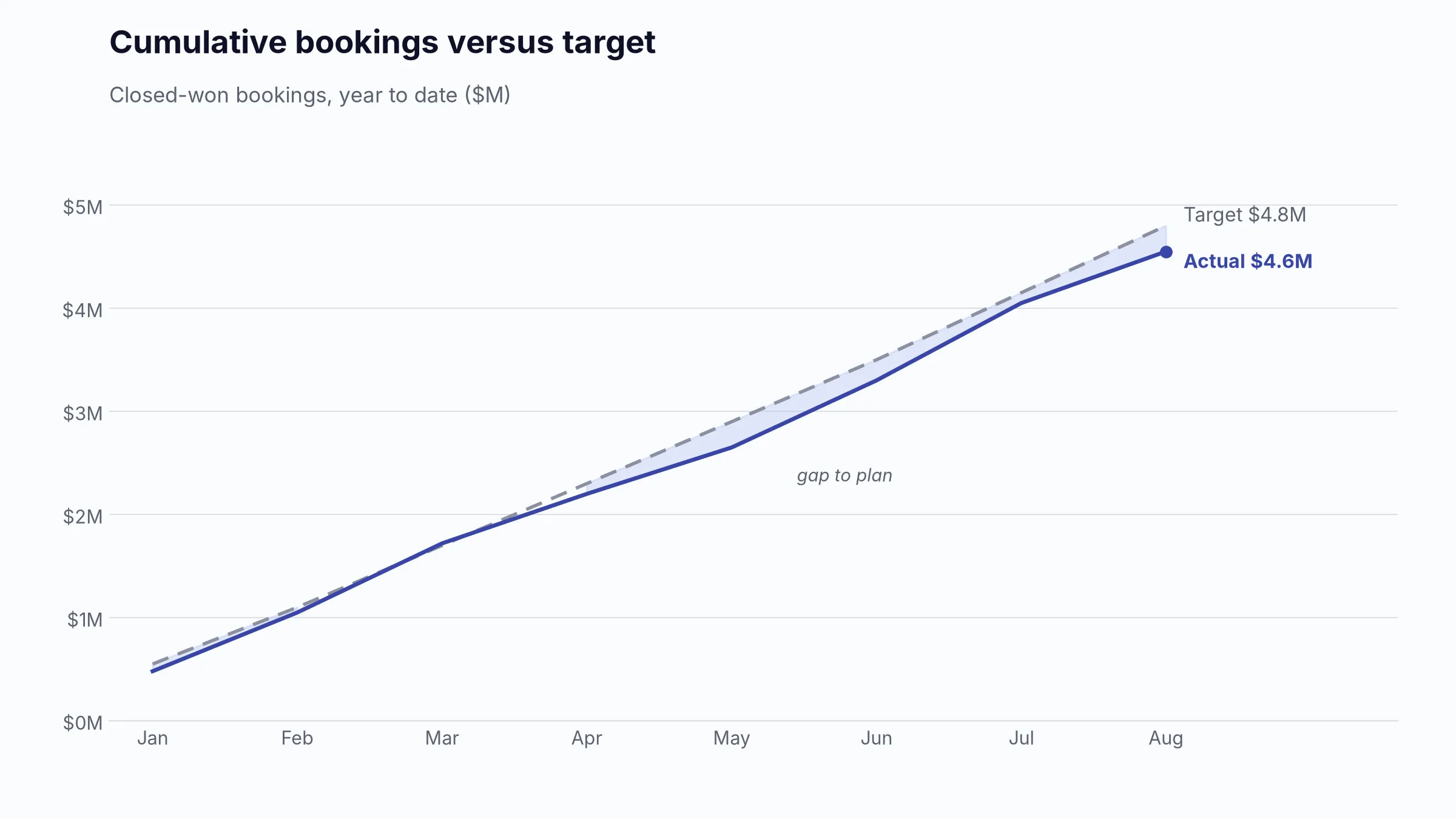
4.2 Actual versus target and pace-to-goal
Level/type: Executive and management; lagging with a forward-looking pace indicator.
Definition/formula: Attainment and variance use the formulas in 3.1. Required daily/weekly pace = Remaining target gap / Remaining selling days or weeks.
Fields: Actual amount/date, targets, business calendar, selling-day flag.
Cadence/chart/filters: Daily or weekly; bullet chart and cumulative actual-versus-target pace line.
Interpretation: A straight-line pace can mislead seasonal businesses or teams with end-loaded enterprise closes. Use a historical seasonality curve where available.
4.3 Revenue by product, service, region, channel, segment, or representative
Level/type: Management; diagnostic.
Definition/formula: Sum the governed amount by one dimension, then calculate share and growth within each group.
Fields: Amount/date plus normalized Product ID, Region, Channel, Segment, Rep ID, and Customer ID.
Cadence/chart/filters: Weekly or monthly. Sorted horizontal bars for comparison; stacked bars only for a stable, small number of mix categories; map only when geography changes a decision.
Interpretation: A high-revenue category may have poor margin or low retention. Avoid showing more than one or two breakdowns in the same chart.
4.4 Average deal size or average order value
Level/type: Management; diagnostic and partly leading.
Definition/formula: B2B Average deal size = Closed-won credited value / Number of closed-won opportunities; commerce AOV = Net order revenue / Number of completed orders [9].
Fields: Opportunity/Order ID, final status, amount, close/order date, refunds policy.
Cadence/chart/filters: Monthly; trend line and box plot or distribution by segment.
Interpretation: The mean is sensitive to a few large deals. Show median and deal-size bands for skewed B2B pipelines.
4.5 Average revenue per customer or account
Level/type: Executive or management; lagging.
Definition/formula: ARPC = Revenue in period / Distinct active customers in period. Subscription teams may use ARPA or ARPU with an explicit account/user denominator.
Fields: Customer ID, active status or transaction date, revenue amount, account hierarchy.
Cadence/chart/filters: Monthly/quarterly; KPI and trend, segmented bar by customer tier.
Interpretation: Migrations between account IDs, free users, parent-child accounts, and partial periods can change the denominator without an economic change.
4.6 New business, existing-customer, expansion, upsell, and cross-sell revenue
Level/type: Executive and management; lagging and diagnostic.
Definition/formula: Sum revenue or bookings by governed Revenue Type. New business comes from customers whose first eligible purchase or contract occurs in the period; expansion is incremental value from existing customers.
Fields: Customer ID, first purchase/start date, Revenue Type, product family, amount, date, prior product/contract state.
Cadence/chart/filters: Monthly; stacked columns for mix and a waterfall for beginning recurring revenue to ending recurring revenue.
Interpretation: Do not infer expansion from customer name alone. Define reactivation, price increases, usage growth, upsell, and cross-sell separately if those decisions matter.
4.7 Recurring versus one-time revenue
Level/type: Executive; lagging and diagnostic.
Definition/formula: Sum revenue by Recurring/One-Time classification. MRR normalizes eligible recurring charges to a monthly value and excludes one-time payments and professional services under the stated policy [7].
Fields: Contract/subscription ID, customer, charge type, billing interval, start/end date, recurring amount, one-time amount.
Cadence/chart/filters: Monthly; stacked columns and recurring-share trend.
Interpretation: Do not add total contract value to MRR. Usage-based, seasonal, and ramped contracts require documented normalization rules.
4.8 Gross profit, gross margin, contribution profit, and contribution margin
Level/type: Executive and management; lagging/diagnostic.
Definition/formula: Gross profit = Revenue - COGS; Gross margin % = Gross profit / Revenue; Contribution profit = Revenue - Defined variable costs; Contribution margin % = Contribution profit / Revenue.
Fields: Revenue, COGS, variable-cost categories, Product/Order/Customer IDs.
Cadence/chart/filters: Monthly; trend lines and sorted product/channel bars.
Interpretation: Use finance-approved cost definitions. A contribution view is especially important in e-commerce, marketplaces, agencies, and services where fulfillment or labor varies with sales.
5. Pipeline metrics
Pipeline is a stock of uncertain future opportunities. It must never be added to completed revenue or presented as guaranteed income.
5.1 Total open pipeline value
Level/type: Management; leading.
Definition/formula: Σ Opportunity amount for open, qualified opportunities, usually restricted to an expected close period.
Fields: Opportunity ID, amount, status, stage, qualification flag, expected close date, currency.
Cadence/chart/filters: Daily/weekly; KPI plus stage bar and close-month columns.
Interpretation: State whether the number includes early-stage, unqualified, renewal, expansion, and future-period deals. Large total pipeline with weak quality is not healthy pipeline.
5.2 Weighted pipeline value
Level/type: Management; leading and model-dependent.
Definition/formula: Weighted pipeline = Σ(Deal amount × Probability). Probability may be stage-based, model-based, or manually entered.
Fields: Opportunity ID, amount, stage/probability, expected close date, status.
Cadence/chart/filters: Weekly; KPI and paired unweighted-versus-weighted bars.
Interpretation: Stage probabilities must be calibrated against actual historical conversion by segment. Manual probabilities often create false precision; weighted pipeline is a model, not a commitment.
5.3 Pipeline coverage ratio
Level/type: Executive/management; leading.
Definition/formula: See 3.5. A rough required ratio can be estimated as 1 / historical win rate, then adjusted for timing, deal mix, and pipeline quality [4].
Fields: Qualified open value, expected close period, target, win rate history.
Cadence/chart/filters: Weekly; bullet chart and coverage trend.
Interpretation: Compare like-for-like segments. Enterprise and SMB pipelines usually need different coverage assumptions.
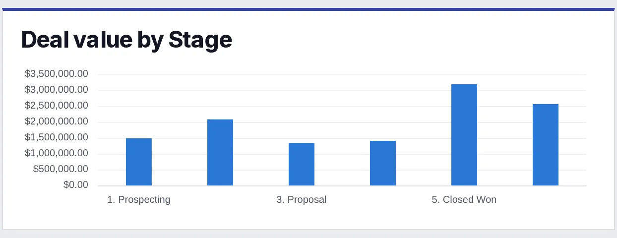
5.4 Opportunities and value by stage
Level/type: Management and operational; leading/diagnostic.
Definition/formula: Distinct opportunity count and sum of amount in each current stage.
Fields: Opportunity ID, stage, amount, status, expected close date, stage order.
Cadence/chart/filters: Daily/weekly; horizontal bars for value and count.
Interpretation: A current-stage snapshot is not a conversion funnel. It mixes cohorts of different ages and cannot show how many records moved from one stage to the next.
5.5 Pipeline created during the period
Level/type: Management; leading.
Definition/formula: Count and sum of opportunities that first became qualified during the period. Use qualified date when available, not record creation date.
Fields: Opportunity ID, created date, qualified date, amount at creation/qualification, source, owner, segment.
Cadence/chart/filters: Weekly/monthly; columns by week and bars by source or rep.
Interpretation: Track both value and count. A few large opportunities can hide falling creation volume; tiny low-quality records can inflate count.

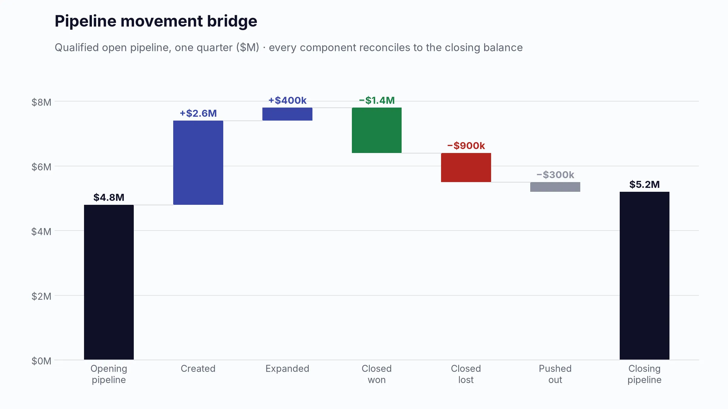
5.6 Pipeline movement and change bridge
Level/type: Management; leading/diagnostic.
Definition/formula: Reconcile opening pipeline to ending pipeline through created deals, amount increases, amount decreases, wins, losses, deletions, and close-date slips. Net movement = Ending pipeline - Opening pipeline.
Fields: Opportunity snapshots or change history containing timestamp, prior/current amount, stage, status, close date, owner.
Cadence/chart/filters: Weekly; waterfall chart with a supporting changed-deals table.
Interpretation: A current-state spreadsheet cannot reconstruct movement. Store weekly snapshots or an OpportunityHistory table. Salesforce’s history object records changes to amount, probability, stage, and close date [16].
5.7 Sales or pipeline velocity
Level/type: Management; leading/diagnostic.
Definition/formula: Velocity = Qualified opportunity count × Average deal value × Win rate / Average sales-cycle days, expressed as expected sales value per day [3].
Fields: Qualified opportunities, amounts, closed outcomes, qualified/start date, close date.
Cadence/chart/filters: Monthly/quarterly; KPI with a trend and decomposition into its four drivers.
Interpretation: Calculate by segment; HubSpot recommends separating SMB, mid-market, and enterprise pipelines because their economics differ [3]. The formula combines historical and current inputs, so label the period and cohort.
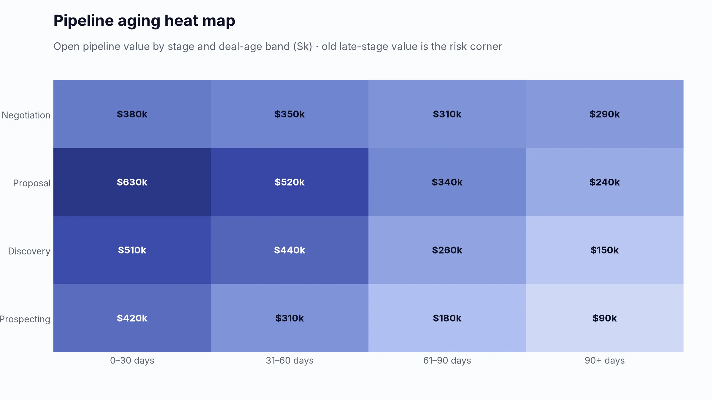
5.8 Deal age and stage age
Level/type: Operational/management; leading and diagnostic.
Definition/formula: Deal age = As-of date - Opportunity created or qualified date; Stage age = As-of date - Current-stage entry date. Use median and percentiles, not only mean.
Fields: Opportunity ID, created/qualified date, stage-entered timestamp, current stage, as-of date.
Cadence/chart/filters: Daily/weekly; age-band stacked bars, box plots, or a heat map by stage and owner.
Interpretation: Age is expected to differ by stage, segment, product, and deal size. A 60-day enterprise negotiation and a 60-day SMB discovery are not equivalent.
5.9 Stalled opportunities and deals without recent activity
Level/type: Operational; leading.
Definition/formula: Rule-based count/value where stage age exceeds a stage-specific threshold, last meaningful human activity is older than a threshold, or no future next step exists.
Fields: Opportunity ID, stage, stage-entry date, last meaningful activity date, next-step date, amount, owner.
Cadence/chart/filters: Daily; exception KPI and conditional-format table.
Interpretation: Define meaningful activity so automated email logging does not make a dead deal look active. Use stage-specific thresholds derived from historical distributions.
5.10 Expected close dates and close-date distribution
Level/type: Management/operational; leading.
Definition/formula: Count and value of open opportunities grouped by expected close week or month. Also show value with dates in the past.
Fields: Opportunity ID, expected close date, amount, stage, status, owner.
Cadence/chart/filters: Daily/weekly; columns by close period plus an exception table.
Interpretation: End-of-month or end-of-quarter clustering often indicates placeholder dates. Show exact-date completeness and overdue close dates.
5.11 Deals pushed into future periods
Level/type: Management; leading/diagnostic.
Definition/formula: Count and value of opportunities whose expected close date moved from the original or prior forecast period into a later period. Push rate = Pushed eligible deals / Deals scheduled at period start.
Fields: Opportunity ID, prior and current close dates, change timestamp, amount, stage, owner, push reason.
Cadence/chart/filters: Weekly; trend line, waterfall, and pushed-deal table.
Interpretation: Requires snapshots or field history. Repeated pushing is a stronger risk signal than a single justified reschedule.
5.12 Pipeline by representative, region, product, segment, and lead source
Level/type: Management; diagnostic.
Definition/formula: Count, unweighted value, weighted value, coverage, and age by dimension.
Fields: All core pipeline fields plus normalized dimension IDs.
Cadence/chart/filters: Weekly; ranked bars, small multiples, and a matrix with conditional formatting.
Interpretation: Do not rank representatives on raw pipeline alone. Compare coverage, quality, conversion, and territory potential.
6. Funnel and conversion metrics
Funnel analysis requires a defined population, ordered stages, and timestamps. A current snapshot answers “where are records now?” A conversion analysis answers “what share of an eligible cohort progressed?” These are different questions.
6.1 Lead-to-opportunity conversion rate
Level/type: Management; leading/diagnostic.
Definition/formula: Distinct leads that created a qualified opportunity / Eligible leads in the cohort × 100. Define whether the denominator is all leads, accepted leads, MQLs, or SQLs.
Fields: Lead ID, cohort timestamp, source, qualification status, linked Opportunity ID, opportunity-qualified date.
Cadence/chart/filters: Weekly/monthly; cohort trend and bars by source, campaign, segment, or rep.
Interpretation: Use a matured cohort or show time-to-conversion. Comparing recent and old cohorts without accounting for maturation will understate recent performance.
6.2 Opportunity-to-win conversion and overall win rate
Level/type: Executive/management; lagging and diagnostic.
Definition/formula: Wins / (Wins + Losses) × 100 for decided, qualified opportunities. Value-weighted win rate is Won amount / (Won amount + Lost amount).
Fields: Opportunity ID, qualified date, final status, close date, amount.
Cadence/chart/filters: Monthly/quarterly; line plus segmented bars.
Interpretation: Show count-based and value-based rates separately. A team can win many small deals while losing most economic value.
6.3 Loss rate
Level/type: Management; lagging/diagnostic.
Definition/formula: Closed-lost / (Closed-won + Closed-lost) × 100.
Fields: Opportunity ID, final status, close date, amount, loss reason.
Cadence/chart/filters: Monthly; trend and bars by segment, product, competitor, source, or stage lost.
Interpretation: “No decision,” disqualified opportunities, duplicates, and administrative closures should be governed; otherwise loss rate becomes a data-cleanup measure rather than a selling measure.
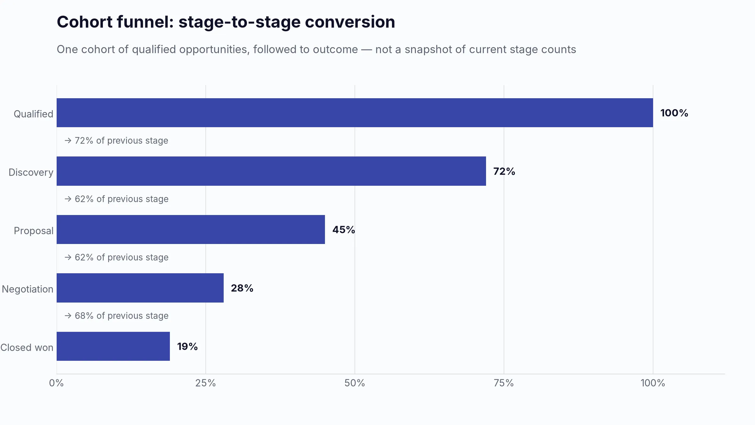
6.4 Stage-to-stage conversion and funnel leakage
Level/type: Management; leading/diagnostic.
Definition/formula: Stage conversion = Distinct opportunities entering next required stage / Distinct opportunities entering current stage × 100; Leakage = 100% - Conversion.
Fields: Opportunity ID, stage name/order, stage entry and exit timestamps, terminal status.
Cadence/chart/filters: Monthly/quarterly; funnel for a single sequential cohort, plus a stage-conversion matrix or bars.
Interpretation: A funnel is valid only when stages are sequential and the same population flows through them. Microsoft recommends funnels for connected stages and bottleneck detection, not unrelated categories [22]. Reopened or skipped stages need an explicit rule.
6.5 Lead response time
Level/type: Operational/management; leading.
Definition/formula: First meaningful human response timestamp - Eligible lead arrival or assignment timestamp. Report median, 75th/90th percentile, and % within SLA; the mean alone is easily distorted.
Fields: Lead ID, inquiry/assignment timestamp, first human response timestamp, business hours/timezone, owner, source.
Cadence/chart/filters: Daily/weekly; KPI, percentile trend, SLA distribution, and overdue-lead table.
Interpretation: Automated acknowledgements should not count unless policy says they do. The HBR research on online leads established response speed as a material management issue, but each business should set its SLA from channel expectations and observed conversion rather than copy a universal threshold [18].
6.6 Sales-qualified lead volume
Level/type: Management/operational; leading.
Definition/formula: Distinct leads meeting the documented SQL acceptance criteria during the period.
Fields: Lead ID, SQL date, status, acceptance flag, source, segment, owner.
Cadence/chart/filters: Weekly; columns by week and bars by source/segment.
Interpretation: Volume is meaningful only if the qualification definition is stable. Pair SQL volume with SQL-to-opportunity conversion and rejection reasons.
6.7 Opportunities created
Level/type: Management; leading.
Definition/formula: Distinct qualified opportunities created or qualified in the period; report both count and initial value.
Fields: Opportunity ID, created/qualified date, initial amount, source, owner, segment.
Cadence/chart/filters: Weekly/monthly; columns and source bars.
Interpretation: Current opportunity amount can reflect later expansion. Preserve initial amount or a snapshot if the goal is to measure pipeline generation at creation.
6.8 Closed-won and closed-lost outcomes
Level/type: Management; lagging.
Definition/formula: Distinct opportunity count and amount by final status and close period.
Fields: Opportunity ID, final status, close date, amount, rep, product, source, segment.
Cadence/chart/filters: Weekly/monthly; paired columns and a detailed outcome table.
Interpretation: Never count opportunity-product rows as separate deals unless the metric is explicitly line-item wins. Use Opportunity ID for deal count and line IDs for product revenue.
6.9 Lost-deal reasons
Level/type: Management; diagnostic.
Definition/formula: Count and lost value by governed primary loss reason; also calculate share of losses.
Fields: Opportunity ID, close status/date, amount, loss reason code, competitor, notes optional.
Cadence/chart/filters: Monthly/quarterly; Pareto chart and segmented bars.
Interpretation: A Pareto chart ranks reasons and shows cumulative share, helping identify the few drivers that explain most lost value [21]. Do not mix “price,” “no decision,” “bad fit,” and blank values. Loss reasons are often self-reported and should be audited.
Funnel questions the dashboard should answer
- Is enough qualified demand entering the top of the sales process?
- Which stage has the largest absolute and percentage loss?
- Is the bottleneck caused by poor lead quality, response delay, qualification, proposal acceptance, procurement, or closing?
- Are conversion rates changing because of seller behavior or because the segment, source, product, or deal-size mix changed?
- How long does conversion take, and have recent cohorts had enough time to mature?
7. Sales activity and productivity metrics
Activity is an input, not an outcome. Executive dashboards should not celebrate call or email counts. Activity metrics are useful for capacity planning, coaching, service-level management, and diagnosing a specific funnel problem.
7.1 Calls, emails, meetings, demos, and proposals
Level/type: Operational; leading only when linked to a next outcome.
Definition/formula: Count distinct completed activities by type and period. Separate attempted, completed, held, and buyer-engaged activities.
Fields: Activity ID, Opportunity/Lead/Customer ID, Rep ID, type, outcome, start/completion timestamp, direction, automated flag.
Cadence/chart/filters: Daily/weekly; small-multiple columns or a compact activity table.
Interpretation: Logging automation can inflate volume. A sent email and a held decision-maker meeting should not be treated as equivalent units.
7.2 Activities per representative
Level/type: Operational/management; diagnostic.
Definition/formula: Completed eligible activities divided by active selling days or active full-time equivalent where comparisons are needed.
Fields: Activity records, Rep ID, employment/ramp/leave dates, business calendar.
Cadence/chart/filters: Weekly; ranked bars with role and ramp filters.
Interpretation: Do not impose one activity target across account executives, SDRs, field sellers, and strategic-account teams. More activity can indicate poor targeting rather than productivity.
7.3 Activity-to-opportunity conversion
Level/type: Management; leading/diagnostic.
Definition/formula: Qualified opportunities created after eligible engagement / Engaged eligible leads or accounts × 100. Use a defined attribution window and avoid counting every touch as a separate denominator.
Fields: Activity ID/timestamp/outcome, Lead/Account ID, Opportunity ID and qualified date, source and owner.
Cadence/chart/filters: Monthly; conversion bars by activity type/channel and cohort trend.
Interpretation: Attribution is not causation. Compare like cohorts and avoid assigning the same opportunity to multiple activities without an attribution rule.
7.4 Activity-to-revenue relationship
Level/type: Management; diagnostic.
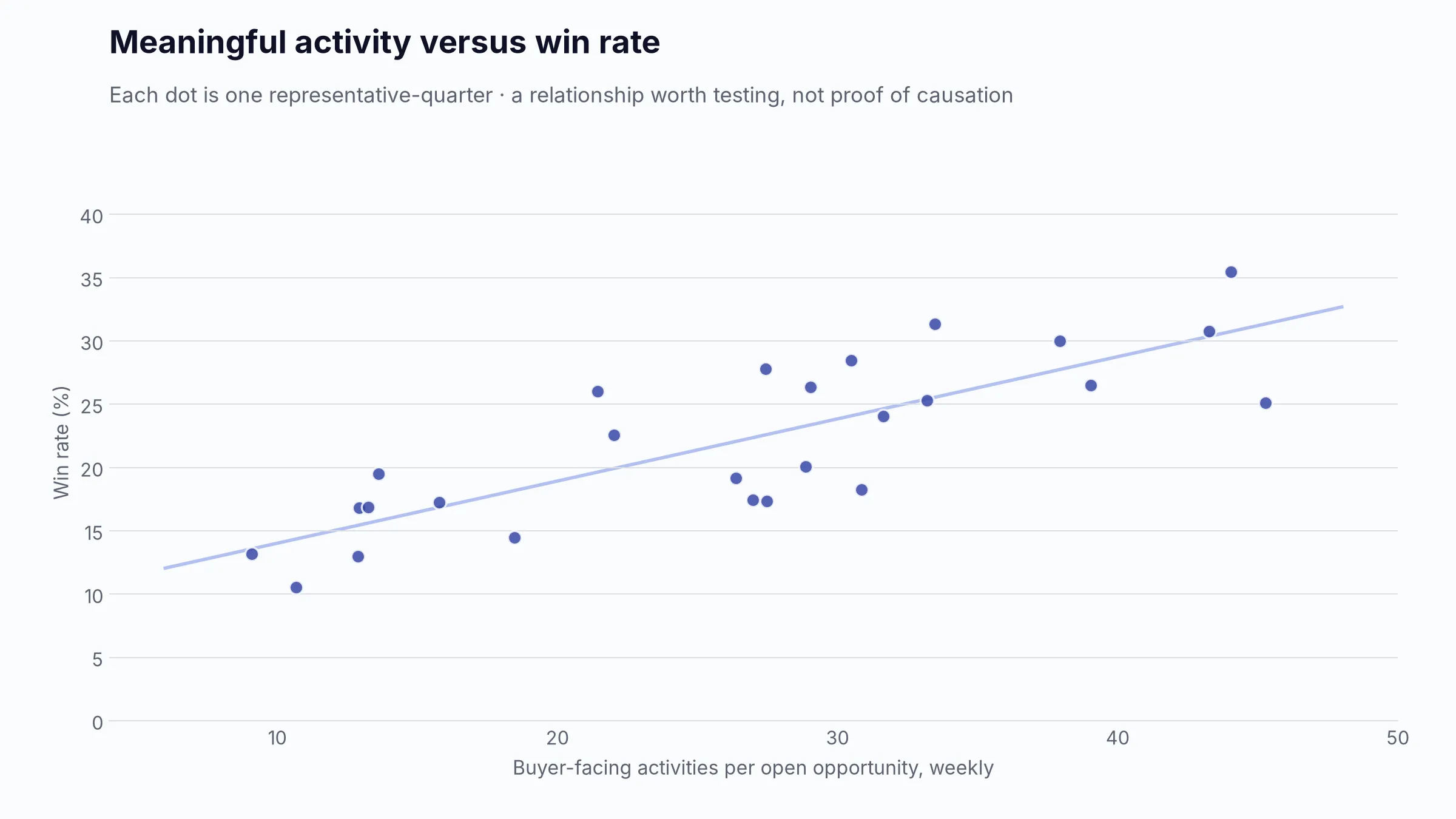
Definition/formula: Analyze revenue or win rate across activity bands, or use a scatter plot of meaningful engagement versus outcomes by rep/account. This is not a universal ratio.
Fields: Linked activities, opportunities, revenue outcome, rep/account attributes, time window.
Cadence/chart/filters: Monthly/quarterly; scatter plot with trend line and segment controls.
Interpretation: Correlation does not prove that added activity caused revenue. Large, difficult deals naturally require more activity. Control for segment, deal size, role, and sales-cycle age.
7.5 Follow-up completion and next-step coverage
Level/type: Operational; leading.
Definition/formula: On-time completion = Due follow-ups completed by due date / Follow-ups due × 100; Next-step coverage = Open opportunities with a future dated next step / Open opportunities × 100.
Fields: Task/Activity ID, due date, completion date, Opportunity ID, next-step text/date, owner.
Cadence/chart/filters: Daily; KPI and overdue exception table.
Interpretation: Repeatedly rescheduled tasks can appear compliant. Preserve original due date or reschedule count when discipline matters.
7.6 Average response time to active buyers
Level/type: Operational; leading.
Definition/formula: Time from an eligible buyer message or request to the first meaningful human reply, measured within stated business hours. Report median and SLA compliance.
Fields: Incoming event timestamp, reply timestamp, channel, customer/opportunity, owner, timezone.
Cadence/chart/filters: Daily/weekly; percentile trend and SLA table.
Interpretation: Keep this separate from new-lead response time. Exclude spam, auto-replies, and messages outside the supported channel scope.
7.7 Sales cycle length
Level/type: Executive/management; lagging and diagnostic.
Definition/formula: Actual close date - Qualified opportunity start date for won deals; show median, average, and percentiles.
Fields: Opportunity ID, qualified/start date, final close date, status, segment, amount.
Cadence/chart/filters: Monthly/quarterly; trend line, box plot, and bars by segment.
Interpretation: Use won cohorts for realized cycle length and open-deal age for current risk. Averages across SMB and enterprise pipelines are usually meaningless.
7.8 Time spent in each pipeline stage
Level/type: Management/operational; leading/diagnostic.
Definition/formula: Stage exit timestamp - Stage entry timestamp, summarized by median and percentiles for each stage and outcome.
Fields: Opportunity ID, Stage ID, entry timestamp, exit timestamp, status/outcome.
Cadence/chart/filters: Weekly/monthly; heat map or box plot by stage and segment.
Interpretation: Requires a StageHistory table. Current stage-entry date only measures the active stage and cannot reconstruct prior stages.
7.9 Quota attainment
Level/type: Executive/management/operational; lagging.
Definition/formula: See 3.4. Show personal attainment, team attainment, median attainment, share at or above 100%, and gap to target.
Fields: Targets, actual credited value, rep hierarchy, active/ramp dates.
Cadence/chart/filters: Weekly/monthly; bullets and distribution.
Interpretation: Raw leaderboards can be unfair when territory potential, inbound allocation, ramp status, account quality, and credit splits differ.
7.10 Revenue per representative and opportunities handled
Level/type: Management; lagging/diagnostic for revenue, capacity diagnostic for workload.
Definition/formula: Revenue per active FTE = Credited revenue / Average active sales FTE; Opportunities handled = Distinct active opportunities assigned during period.
Fields: Rep ID, active dates, role, FTE/ramp status, opportunity assignments/history, credited revenue.
Cadence/chart/filters: Monthly/quarterly; scatter of workload versus outcome and segmented bars.
Interpretation: Use role- and territory-adjusted comparisons. High workload with low revenue can reflect poor account quality, early ramp, or excessive administrative load.
7.11 Forecast accuracy and bias by representative
Level/type: Management; lagging/diagnostic.
Definition/formula: Use the snapshot formula in 3.6, plus Bias = Forecast - Actual and Commit hit rate = Value or count of committed deals won in period / Committed value or count at cutoff.
Fields: Immutable forecast snapshots, category, opportunity/rep, actual outcome.
Cadence/chart/filters: After each month/quarter; error bars, bias trend, and commit-cohort table.
Interpretation: A conservative forecast can have similar absolute accuracy to an optimistic one. Bias shows direction. Evaluate repeated process quality, not one unusual quarter.
8. Customer and retention metrics
These metrics require a stable Customer ID and, for subscriptions, a history of recurring revenue movements. They should be omitted from a simple new-business dashboard when the source data cannot support them.
8.1 New versus existing-customer revenue
Level/type: Executive/management; lagging/diagnostic.
Definition/formula: Sum governed revenue by whether the customer’s first eligible purchase or contract date falls in the reporting period.
Fields: Customer ID, first purchase/start date, transaction date, amount.
Cadence/chart/filters: Monthly; stacked columns and mix trend.
Interpretation: A renamed or duplicated customer can be falsely classified as new. Resolve parent-child accounts and mergers.
8.2 Customer acquisition cost
Level/type: Executive/management; lagging and unit-economic.
Definition/formula: CAC = Eligible sales and marketing acquisition cost / New customers acquired. Use a cohort and time window aligned with the sales cycle.
Fields: Spend by period/channel, sales labor allocation if included, new Customer IDs, acquisition dates, source.
Cadence/chart/filters: Monthly/quarterly; KPI, trend, and bars by channel/segment.
Interpretation: State whether salaries, commissions, tools, agencies, and brand spend are included. Shopify likewise frames CAC as acquisition cost divided by new customers [9]. A one-month cost numerator against customers closing after a six-month cycle is misleading.
8.3 Customer lifetime value
Level/type: Executive/management; modeled, not directly observed for young cohorts.
Definition/formula: A simple transactional model is Average order value × Purchase frequency × Customer lifespan; a margin-adjusted model multiplies by gross margin [9]. Subscription teams may use ARPA × Gross margin % / Customer churn rate only when churn is stable and consistently measured.
Fields: Customer transactions or recurring revenue, purchase frequency, start/end dates, gross margin, churn.
Cadence/chart/filters: Quarterly; KPI and cohort/distribution view.
Interpretation: Label observed versus modeled LTV. Small samples, changing retention, negative churn, and immature cohorts make simplified formulas unstable.
8.4 Customer retention and churn
Level/type: Executive/management; lagging.
Definition/formula: Customer retention = (Ending customers - New customers acquired) / Starting customers × 100; Logo churn = Customers lost / Starting customers × 100.
Fields: Customer ID, active-at-start flag, activation date, churn/end date, status.
Cadence/chart/filters: Monthly/quarterly; trend and cohort heat map.
Interpretation: Define active, lost, paused, seasonal, and reactivated customers. Retention and churn are not always exact complements when reactivation or cohort rules differ.
8.5 Repeat purchase rate
Level/type: Management; lagging/diagnostic.
Definition/formula: Customers making a second eligible purchase within the measurement window / Customers eligible to repeat × 100.
Fields: Customer ID, Order ID, order date, order status, product/channel.
Cadence/chart/filters: Monthly with cohort follow-up; cohort heat map and trend.
Interpretation: The denominator must have enough time to repeat. A same-period numerator/denominator can penalize customers acquired late in the period.
8.6 Renewal rate
Level/type: Executive/management; leading before due date and lagging after outcome.
Definition/formula: Renewal rate = Eligible contracts renewed / Contracts due for renewal × 100; also show value-based renewal.
Fields: Contract/subscription ID, Customer ID, renewal due date, starting value, renewal outcome/date/value, owner.
Cadence/chart/filters: Weekly for upcoming renewals; monthly/quarterly outcome. Use a renewal calendar, KPI, and risk table.
Interpretation: Exclude contracts not yet eligible and define auto-renewal, early renewal, downgrade, and partial renewal.
8.7 Expansion revenue and net revenue retention
Level/type: Executive/management; lagging/diagnostic.
Definition/formula: Expansion = Upsell + Cross-sell + Eligible usage/price expansion; NRR formula appears in 3.8. GRR excludes expansion and equals (Starting recurring revenue - Churn - Contraction) / Starting recurring revenue × 100 [8].
Fields: Customer/subscription ID, starting MRR/ARR, movement date/type/value, ending MRR/ARR.
Cadence/chart/filters: Monthly/quarterly; recurring-revenue waterfall, NRR trend, and cohort heat map.
Interpretation: Do not mix recurring expansion with one-time services. Preserve a movement ledger rather than reconstructing movements only from current subscription totals.
8.8 Revenue concentration and top customers
Level/type: Executive/management; diagnostic and risk.
Definition/formula: Top-N concentration = Revenue from top N customers / Total revenue × 100; optionally compute the share from the largest customer and top 10%.
Fields: Customer ID/account hierarchy, revenue, period, segment.
Cadence/chart/filters: Monthly/quarterly; Pareto chart, ranked bar, and exact-value table.
Interpretation: Pareto analysis reveals concentration; it does not prove an 80/20 relationship. Use parent-account rollups and compare revenue concentration with margin and renewal risk.
8.9 At-risk customers
Level/type: Operational/management; leading and model-dependent.
Definition/formula: Count/value of customers meeting a documented risk rule or score, such as upcoming renewal plus declining usage, unresolved issues, overdue payment, negative sentiment, or no executive engagement.
Fields: Customer/contract ID, renewal date/value, usage trend, support/payment/engagement signals, owner, risk reason.
Cadence/chart/filters: Daily/weekly; risk KPI and prioritized table.
Interpretation: “At risk” is not a universal field. Show the reasons and thresholds behind the score so the list is actionable and auditable.
8.10 Customer cohort performance
Level/type: Management; lagging/diagnostic.
Definition/formula: Group customers by acquisition/start month or quarter, then measure retention, repeat rate, revenue, margin, or NRR at the same age since acquisition.
Fields: Customer ID, cohort date, period activity/revenue/margin, churn/renewal movements.
Cadence/chart/filters: Monthly/quarterly; cohort heat map and age-aligned lines.
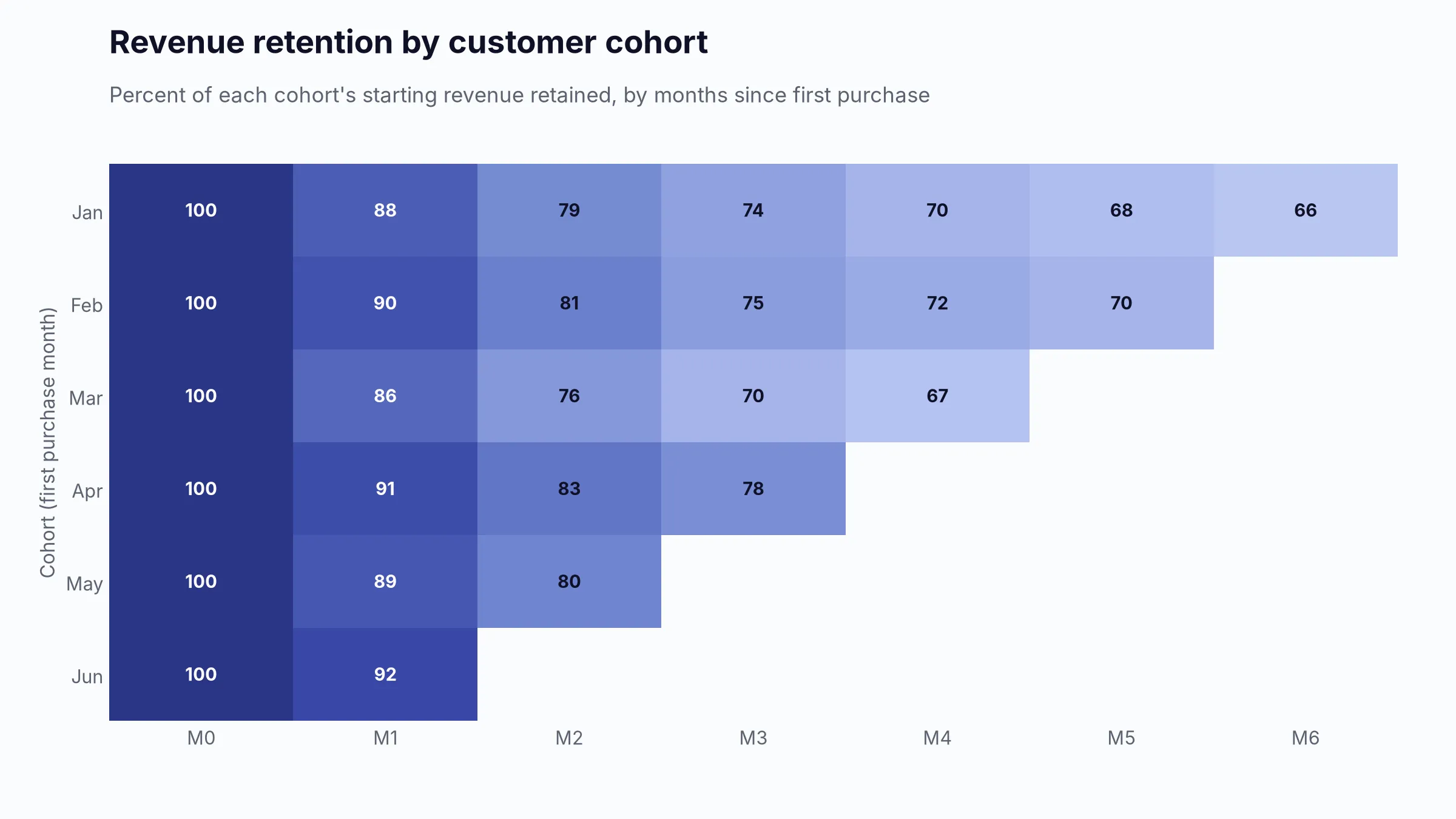
Interpretation: Cohorts solve the unequal-age problem. Recent cohorts have incomplete later periods; display blanks rather than zeros. ChartMogul uses cohorts to track how recurring revenue changes after subscription start [8].
9. Recommended dashboard layout
The ideal layout is a hierarchy, not a single dense canvas. Use a summary page and progressively deeper sections. Each section should end with a record-level table when action is possible.
9.1 Executive summary
Question: Are we on plan, what is likely to happen, and what requires attention?
KPIs: Actual versus target, growth, margin, quota attainment, forecast, qualified pipeline coverage, win rate, retention/NRR where relevant.
Visuals: Six to eight KPI cards with comparison context; bullet charts for target metrics; one 12-month trend; a concise risk/exception list.
Detail: Company and business-unit level. Avoid raw activity.
Filters: Reporting period, business unit, region, product family, currency.
9.2 Revenue performance
Question: How much was sold, how is it changing, and where did it come from?
KPIs: Period sales/bookings, growth, average deal/order value, new versus existing, recurring versus one-time, gross/contribution margin.
Visuals: Time-series line, sorted bars by product/region/channel, mix columns, variance waterfall.
Detail: Monthly trend with drilldown to transaction or won-deal rows.
Filters: Date, product, region, channel, segment, customer type, rep.
9.3 Target and quota performance
Question: Which teams or sellers are on track, and where is the gap?
KPIs: Attainment, gap to target, required pace, median attainment, share of reps at target.
Visuals: Bullet charts, cumulative actual-versus-target pace line, ranked bars, distribution histogram.
Detail: Team and rep, with ramp/territory context.
Filters: Manager, role, rep, territory, quota period, ramp status.
9.4 Pipeline health
Question: Is there enough credible pipeline and is it progressing?
KPIs: Total and weighted pipeline, coverage, pipeline created, stage value/count, deal age, stalled/inactive value, pushed deals.
Visuals: Coverage bullet, stage bars, pipeline movement waterfall, age heat map, conditional-format deal table.
Detail: Segment and rep level; drill to opportunity.
Filters: Expected close period, stage, forecast category, rep, segment, source, product.
9.5 Sales funnel and conversion
Question: Where are leads and opportunities failing to progress?
KPIs: Lead-to-opportunity, stage conversion, opportunity-to-win, loss rate, lead response, loss reasons.
Visuals: Cohort funnel for valid sequential stages, stage-conversion bars, loss-reason Pareto, response-time distribution.
Detail: Cohort and source/segment breakdown.
Filters: Cohort date, source, segment, product, rep, deal-size band.
9.6 Forecasting
Question: What will close, how confident are we, and how reliable has the process been?
KPIs: Submitted forecast, category forecast, weighted pipeline, commit amount, upside, forecast accuracy, error, bias, push rate.
Visuals: Forecast-versus-actual columns, category bridge, forecast-history line, error/bias trend, close-date distribution, deal table.
Detail: Current period plus immutable weekly snapshots.
Filters: Forecast cutoff, period, team, rep, category, segment.
9.7 Team performance
Question: Who needs coaching, capacity, better opportunity allocation, or recognition?
KPIs: Attainment, win rate, cycle length, average deal size, qualified pipeline coverage, pipeline created, workload, forecast accuracy.
Visuals: Multi-metric matrix, scatter plots, bullet charts, attainment distribution.
Detail: Role-appropriate rep view with territory and ramp context.
Filters: Manager, role, tenure, ramp status, territory, segment.
9.8 Product and customer analysis
Question: Which products, customers, and segments drive profitable, durable growth?
KPIs: Revenue and margin by product, average deal/order value, top-customer concentration, repeat purchase, renewal, expansion, NRR, cohort performance.
Visuals: Sorted bars, Pareto, recurring-revenue waterfall, cohort heat map, customer table.
Detail: Product and customer with parent-account rollup.
Filters: Product, customer tier, cohort, segment, channel, region.
9.9 Sales activity
Question: Are teams completing the right work at the right time?
KPIs: Meaningful activities, held meetings, demos, proposal turnaround, follow-up completion, next-step coverage, response time, activity-to-opportunity conversion.
Visuals: Small-multiple columns, SLA trend, conversion bars, overdue task table.
Detail: Rep, lead, account, and opportunity level.
Filters: Rep, role, activity type/outcome, channel, date, source.
9.10 Risks, exceptions, and opportunities
Question: Which exact records require intervention now?
KPIs: Stalled value, overdue close dates, no-activity value, missing next steps, pushed deals, forecast gaps, upcoming renewals, at-risk value, data-quality error count.
Visuals: Conditional-format tables with owner and next action; small exception cards.
Detail: Record level. This is where the dashboard becomes operational.
Filters: Owner, severity, stage, due date, risk reason, amount band.
10. KPI-to-chart mapping table
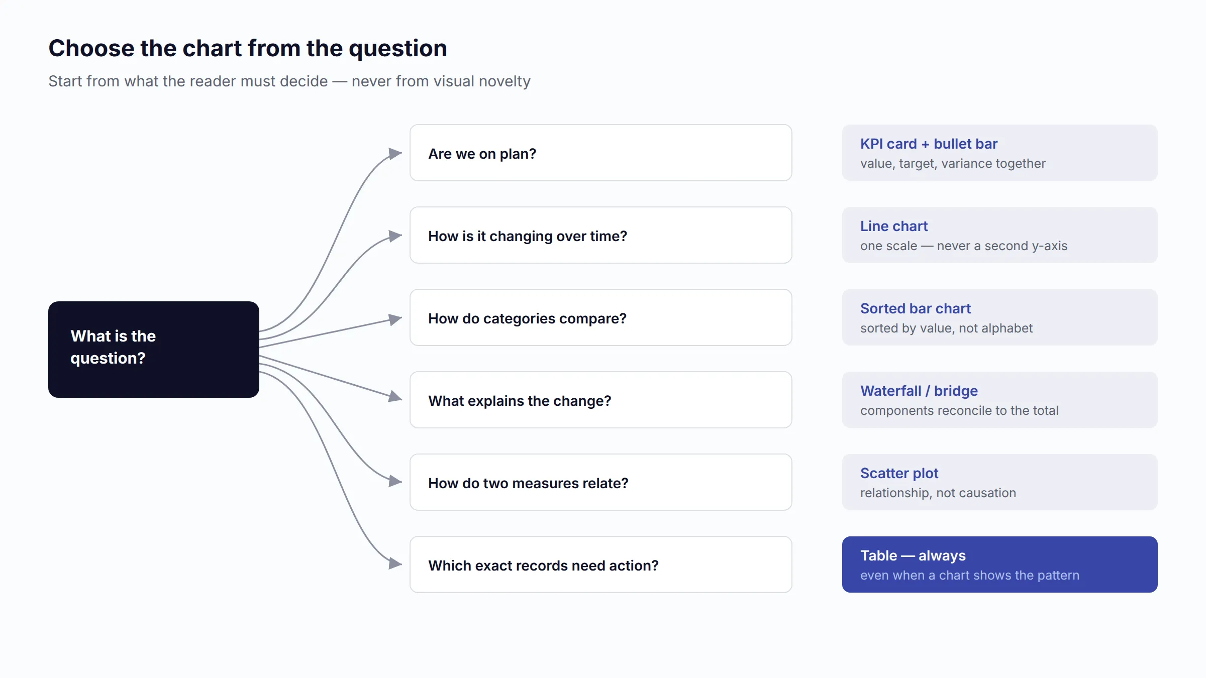
Chart choice should follow the question. Microsoft’s visualization guidance recommends bars for categorical comparisons, lines for continuous time, waterfalls for additive changes, funnels for sequential processes, scatter plots for relationships, tables for exact values, and cards for a single prominent fact [11]. Tableau notes that bullet charts were designed as a more efficient target-tracking alternative to gauges [12].
| KPI or question | Best primary visual | Useful alternative | When it can mislead |
|---|---|---|---|
| Total sales or bookings | KPI card with target and prior-period variance | Line chart for trend | A card without target, period, definition, or comparison has little meaning. |
| Revenue growth | Line or variance columns | Rolling-12-month line | Partial periods and seasonality can create false changes. |
| Actual versus target | Bullet chart | Paired columns; cumulative pace line | A gauge wastes space and makes cross-team comparison difficult. |
| Revenue by product/region/rep | Sorted horizontal bar | Small multiples | Unsorted bars hide rank; pie charts fail with many categories. |
| Revenue mix over time | Stacked columns with few stable categories | 100% stacked columns for share | Middle segments are hard to compare; category changes break color consistency. |
| Gross or contribution margin | Line plus target band | Sorted bars by product/channel | Revenue and margin on one unsynchronized dual axis can imply a false relationship. |
| Average deal size/AOV | Line plus median | Box plot or distribution | Mean alone is distorted by outliers. |
| New/expansion/churn movement | Waterfall | Stacked movement columns | A waterfall requires mutually exclusive, reconciling components. |
| Pipeline coverage | Bullet chart with internal requirement | KPI card plus trend | A universal 3× target ignores actual win rate and quality. |
| Pipeline value/count by stage | Horizontal bars | Funnel for a valid single cohort | A stage snapshot is not a conversion funnel. |
| Weighted versus unweighted pipeline | Paired bars | Two KPI cards with trend | Weighted value suggests precision that stage probabilities may not deserve. |
| Pipeline movement | Waterfall | Snapshot trend plus change table | Current-state data cannot explain movement without history. |
| Pipeline velocity | KPI plus four-driver decomposition | Trend line by segment | A blended company average hides materially different segments. |
| Deal or stage age | Heat map or box plot | Age-band stacked bars | A red/green threshold without stage-specific expectations is arbitrary. |
| Expected close-date distribution | Columns by week/month | Calendar heat map; exact table | End-period placeholder dates can create artificial clustering. |
| Win/loss rate | Trend line plus segmented bars | 100% stacked won/lost columns | Including open deals or changing the cohort invalidates comparison. |
| Stage conversion | Conversion-rate bars | Funnel; matrix heat map | Funnel width can overstate small differences and fails for non-linear paths. |
| Lead response time | Median/percentile line and SLA bands | Histogram; exception table | Averages hide long-tail failures and after-hours effects. |
| Loss reasons | Pareto chart | Sorted bars by count and value | Self-reported or blank reasons can dominate; 80/20 is not guaranteed. |
| Activity volume | Small-multiple columns | Compact table | A leaderboard encourages volume without quality or outcome. |
| Activity-to-outcome relationship | Scatter plot | Conversion by activity band | Correlation is not causation; deal difficulty drives both activity and duration. |
| Quota attainment by rep | Bullet chart or dot plot | Ranked bars; distribution histogram | Gauges do not support efficient multi-rep comparison. |
| Forecast versus actual | Paired columns or two-line history | Error/bias trend | Using the final overwritten forecast makes accuracy meaningless. |
| Customer concentration | Pareto chart | Ranked bars and Top-N KPI | Customer aliases and parent accounts can understate concentration. |
| Retention/NRR by cohort | Cohort heat map | Age-aligned cohort lines | Recent cohorts are incomplete; blanks must not be shown as zero. |
| Geographic performance | Symbol or filled map only when location matters | Sorted region bars | Area size and color can exaggerate large geographic regions; maps waste space for arbitrary territories. |
| At-risk deals/customers | Conditional-format table | Risk matrix | Color-only encoding is inaccessible and a hidden risk score is not auditable. |
Evaluation of common sales-dashboard visuals
KPI cards
Use for a small number of decision-critical facts. Include the period, target or prior value, absolute and percentage variance, and freshness timestamp. Avoid a wall of cards; cards do not explain drivers.
Line charts
Use for continuous time and trend. Keep intervals consistent and clearly distinguish actual, target, forecast, and prior-year series. Avoid lines for unordered categories and avoid too many series.
Column and bar charts
Use columns for short time comparisons and bars for ranked categories or long labels. Start quantitative axes at zero for ordinary bars. Sort by value unless the category has a natural order.
Stacked bar charts
Use for a small, stable part-to-whole breakdown. They work well for revenue mix or forecast categories when the number of segments is limited. Only the baseline segment is easy to compare across bars; use small multiples or separate bars when every category matters.
Funnel charts
Use for at least four ordered, connected stages and one coherent population [22]. Pair the shape with numeric conversion rates. Do not use a funnel for current pipeline value by stage when deals skip stages, run in parallel, or belong to different cohorts.
Waterfall charts
Use to reconcile a beginning value to an ending value through additive increases and decreases: pipeline movement, recurring-revenue movement, or target variance. Every component must reconcile; overlapping categories invalidate the bridge.
Bullet charts
Use to compare actual with target and optional qualitative ranges. They use position and length efficiently and support scanning across many reps or regions. Prefer bullets over gauges for quota, coverage, and margin targets.
Gauge charts
Reserve for one highly prominent measure in a presentation or wallboard where approximate status matters more than comparison. Gauges consume substantial space, often hide history, and are poor for comparing several teams.
Heat maps
Use for two-dimensional patterns such as stage age by team, conversion by stage and segment, or renewal risk by month. Provide numeric tooltips/labels and a color-blind-safe legend. Do not use a heat map when exact ranking is the primary task.
Scatter plots
Use to explore relationships, clusters, and outliers: activity versus win rate, pipeline coverage versus attainment, or deal size versus cycle length. Add segment controls and a trend line. Never label correlation as causal proof.
Cohort charts
Use when customers or opportunities start at different times and must be compared at equal age. They are essential for retention, repeat purchase, NRR, and time-to-conversion. Keep immature cells blank and show cohort size.
Tables with conditional formatting
Use when users must read exact values and act on records. An exception table should include ID/name, owner, amount/value, stage/status, age, last activity, next step, due date, and risk reason. Use restrained color and icons/text, not color alone.
Geographic maps
Use when physical geography, territory coverage, travel, regulation, or local demand affects the decision. For a simple comparison of five regions, sorted bars are clearer. Normalize country/region names and distinguish sales location, billing location, and assigned territory.
Pareto charts
Use to identify concentration in customers, products, loss reasons, or sources. Bars rank categories; the cumulative line shows their share [21]. Do not assume the result must be 80/20, and show both count and economic value when they lead to different priorities.
11. Spreadsheet data requirements
11.1 Start with the grain
The grain states what one row represents. Examples:
- One row per opportunity.
- One row per order.
- One row per order line.
- One row per sales activity.
- One row per opportunity-stage interval.
- One row per representative-target-period.
- One row per subscription revenue movement.
Do not mix grains in the same table. If an opportunity with three products appears on three rows, summing the full opportunity amount will triple-count pipeline. Store one opportunity row and three line-item rows, or store only allocated line amounts in the line-item table.
11.2 Minimum one-sheet opportunity schema
This design supports a small B2B dashboard but cannot reconstruct pipeline history or stage-to-stage duration.
| Column | Required? | Type | Purpose and validation |
|---|---|---|---|
| OpportunityID | Required | Text, unique | Stable primary key; never use opportunity name as the key. |
| OpportunityName | Recommended | Text | Human-readable label. |
| CustomerID | Recommended | Text | Stable customer key for repeat and concentration analysis. |
| CustomerName | Recommended | Text | Display name; normalize aliases. |
| CreatedDate | Required | Date/time | Record creation; retain separately from qualification. |
| QualifiedDate | Recommended | Date/time | Start of governed sales cycle and pipeline creation. |
| Stage | Required | Controlled text | Must map to one canonical pipeline stage. |
| StageEnteredDate | Recommended | Date/time | Measures current-stage age only. |
| Status | Required | Controlled text | Open, Closed Won, Closed Lost, or governed alternatives. |
| ExpectedCloseDate | Required for pipeline | Date | Expected close period. |
| ActualCloseDate | Required for outcomes | Date | Final outcome date; blank while open. |
| Amount | Required | Decimal | Governed deal/bookings value; nonnegative unless policy supports credits. |
| Currency | Required if multi-currency | ISO code | Example: USD, EUR, MAD. |
| Probability | Optional | Decimal 0-1 | Document whether manual, stage-based, or model-based. |
| ForecastCategory | Optional | Controlled text | Pipeline, Best Case, Commit, Omitted, or company taxonomy. |
| DealType | Recommended | Controlled text | New business, renewal, expansion, reactivation. |
| Product | Optional | Controlled text | Use a separate line-item sheet for multiple products. |
| Region | Recommended | Controlled text | Geographic reporting dimension. |
| CustomerSegment | Recommended | Controlled text | Example: SMB, Mid-Market, Enterprise. |
| LeadSource | Recommended | Controlled text | Normalized original or opportunity source. |
| RepID | Required for team reporting | Text | Stable representative key. |
| RepName | Recommended | Text | Display only; joins should use RepID. |
| LastActivityDate | Recommended | Date/time | Last meaningful human engagement under a stated rule. |
| NextStep | Recommended | Text | Specific planned action. |
| NextStepDate | Recommended | Date/time | Enables overdue and next-step coverage metrics. |
| LossReason | Required when lost | Controlled text | Governed reason code; use notes separately. |
| COGS | Optional | Decimal | Direct cost attributable at the same grain as Amount. |
| VariableCost | Optional | Decimal | Defined variable selling/fulfillment cost. |
| DataUpdatedAt | Required operationally | Date/time | Supports freshness reporting. |
You do not have to build this schema from scratch: the sample sales pipeline workbook (.xlsx) (58 KB) implements this exact table on its Opportunities sheet — 220 opportunities with stable IDs, controlled stages, and governed dates — plus StageHistory and Targets sheets following the multi-sheet model below, and a Data_Dictionary sheet restating the definitions above. Use it as a template for your own export, or open the interactive example dashboard built from its opportunity table.
11.3 Recommended multi-sheet model
For a growing company, use multiple related tables. Microsoft recommends a star-schema approach in which fact tables store events or measurements and dimension tables store descriptive entities used for filtering [13]. Excel relationships likewise require unique identifiers on the lookup side [14].
| Sheet/table | Grain | Primary key | Important foreign keys and measures |
|---|---|---|---|
| Opportunities | One row per opportunity | OpportunityID | CustomerID, RepID, current StageID, Amount, dates, status, source, forecast category |
| StageHistory | One row per opportunity-stage interval or change | StageHistoryID | OpportunityID, StageID, EnteredAt, ExitedAt, prior/current amount and close date |
| Activities | One row per activity | ActivityID | OpportunityID or LeadID, CustomerID, RepID, type, outcome, timestamps, automated flag |
| Targets | One row per target assignment and period | TargetID | RepID/TeamID, PeriodStart, PeriodEnd, MetricType, TargetAmount, Currency |
| OrdersRevenue | One row per order/invoice/revenue event | RevenueEventID | CustomerID, OpportunityID optional, ProductID, RevenueDate, Amount, COGS, Currency |
| OpportunityProducts | One row per opportunity line | OpportunityLineID | OpportunityID, ProductID, Quantity, UnitPrice, Discount, LineAmount, LineCost |
| Customers | One row per customer/account | CustomerID | ParentCustomerID, segment, region, acquisition date, owner, status |
| Products | One row per product/service | ProductID | Product family, recurring flag, standard cost, category |
| Representatives | One row per representative | RepID | ManagerID, TeamID, TerritoryID, role, start/end dates, ramp status |
| Leads | One row per lead | LeadID | Customer/Contact, source, created/assigned/SQL timestamps, owner, converted OpportunityID |
| Subscriptions | One row per subscription/contract | SubscriptionID | CustomerID, ProductID, start/end/renewal dates, opening/current recurring value, status |
| RevenueMovements | One row per recurring movement | MovementID | SubscriptionID, CustomerID, MovementDate, type, MRR/ARR change |
| Date | One row per calendar date | Date | Month, quarter, year, fiscal period, selling-day flag |
11.4 Sample relationship model
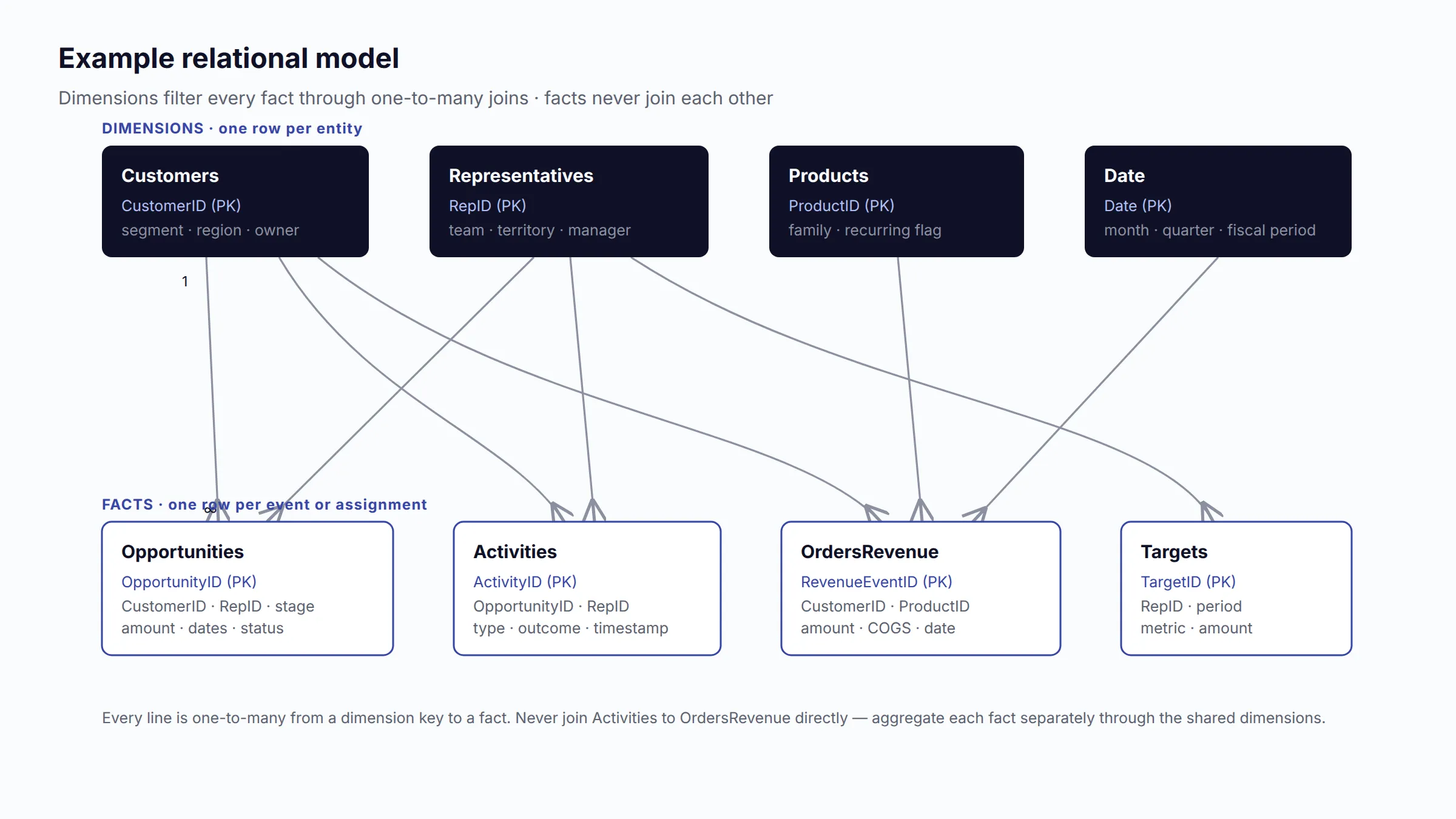
The model below avoids fact-to-fact joins. Shared dimensions filter the event tables through one-to-many relationships.
Core relationships:
Customers.CustomerID 1 → many Opportunities.CustomerIDCustomers.CustomerID 1 → many OrdersRevenue.CustomerIDCustomers.CustomerID 1 → many Activities.CustomerIDRepresentatives.RepID 1 → many Opportunities.RepIDRepresentatives.RepID 1 → many Activities.RepIDRepresentatives.RepID 1 → many Targets.RepIDOpportunities.OpportunityID 1 → many StageHistory.OpportunityIDOpportunities.OpportunityID 1 → many OpportunityProducts.OpportunityIDProducts.ProductID 1 → many OpportunityProducts.ProductIDProducts.ProductID 1 → many OrdersRevenue.ProductIDDate.Date 1 → manyeach fact table’s relevant date key, with role-specific dates governed explicitly.
Important modeling rule: Do not directly join Activities to OrdersRevenue by CustomerID and then sum both; that creates a many-to-many multiplication. Aggregate each fact separately through shared dimensions or use a controlled attribution table.
11.5 Derived fields Sheet2Chart can calculate
- Reporting month, quarter, year, fiscal period, and selling-day index.
- Base-currency amount using a governed exchange-rate date and rate table.
- IsOpen, IsWon, IsLost, IsOverdueClose, IsStalled, HasFutureNextStep.
- Deal age, current-stage age, days since meaningful activity, days to expected close.
- Weighted amount.
- Target attainment, variance, gap, and required pace.
- Stage sort order and stage-group mapping.
- Deal-size band and age band.
- New/existing customer classification from first eligible transaction.
- Gross profit/margin and contribution profit/margin.
- Cohort month and cohort age.
- Retention, churn, repeat-purchase, renewal, GRR, and NRR when sufficient customer/subscription history exists.
- Forecast error, accuracy, and bias from immutable forecast snapshots.
11.6 Data-quality controls
IBM frames data quality around completeness, uniqueness, validity, timeliness, and accuracy [15]. A sales dashboard should expose these controls rather than silently cleaning every issue.
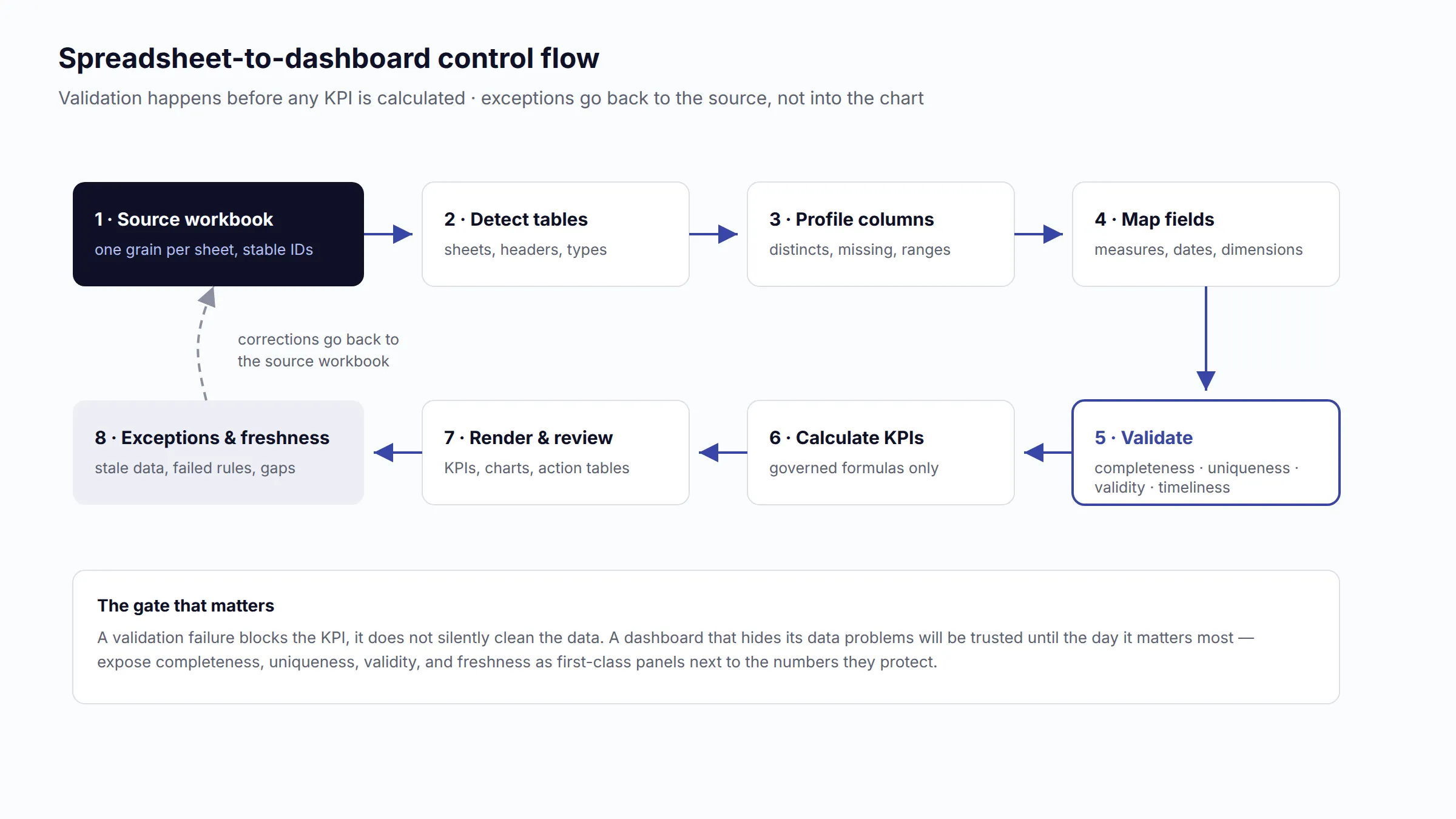
Missing values
- Block or flag records missing the primary key, status, amount, required date, or owner.
- Treat missing Expected Close Date on an open opportunity as an exception, not as zero or today.
- Show “Unknown” as a visible category for missing segment/source only when the record remains analytically valid.
- Do not convert missing amounts to zero unless zero is a legitimate recorded value.
Duplicate opportunities and revenue
- Deduplicate on stable IDs, not names.
- If the same ID appears with conflicting values, quarantine the records or apply a documented latest-update rule.
- Count deals with
DISTINCT OpportunityID. - Keep opportunity and product-line grains separate to prevent amount multiplication.
Inconsistent stages
- Maintain a mapping table from raw values such as “Proposal,” “Proposal Sent,” and “Quote” to a canonical StageID.
- Store stage order, open/closed classification, and probability outside free text.
- Preserve the original value for audit.
- Do not merge stages when they represent materially different buyer commitments.
Currencies
- Store original amount and ISO currency.
- Maintain ExchangeRate, RateDate, and BaseCurrency.
- Define whether pipeline uses current rates, period-end rates, or rates fixed at creation/close.
- Never sum USD, EUR, and MAD as if they were one unit.
Dates and timezones
- Store true dates/timestamps, not locale-dependent strings such as
01/08/26. - Use ISO-style input where possible:
2026-08-01. - Choose one reporting timezone and one fiscal calendar.
- Preserve exact event time for response-time metrics and derive a local reporting date.
Representatives and organizational history
- Join with RepID, not display name or email alone.
- Preserve manager, territory, and role effective dates if historical team reporting must remain stable after reorganization.
- Distinguish active, ramping, leave, and departed sellers.
Customer names and account hierarchy
- Use CustomerID plus a normalized display name.
- Maintain alias and parent-account mappings.
- Decide whether revenue concentration and retention operate at legal entity, billing account, location, or parent-account level.
Freshness
- Show
Data updated atand expected refresh cadence. - Flag stale source sheets and late owner updates.
- For weekly pipeline reviews, retain the as-of timestamp so users know which pipeline state they are seeing.
12. Example dashboard configurations
12.1 Simple dashboard for a small business using one spreadsheet
Target user: Founder, owner-manager, or sales lead with fewer than roughly 10 sellers or a simple transaction/deal process.
Required data: One row per sale or closed opportunity with Record ID, date, status, amount, customer, product/service, channel, region, representative, and optional cost. Add a target table or repeated Target column only if the target is not accidentally duplicated when summed.
KPIs:
- Net sales or closed-won bookings.
- Actual versus target and variance.
- Growth versus comparable prior period.
- Number of sales/deals.
- Average order/deal value.
- Gross or contribution margin if cost exists.
- New versus existing-customer revenue if Customer ID and purchase history exist.
Charts:
- Four KPI cards: sales, attainment, growth, average value.
- Monthly sales line with prior-period comparison.
- Sorted product/service revenue bars.
- Revenue by representative or channel bars.
- Top-customer table or Pareto if customer IDs are reliable.
Filters: Date, product/service, representative, channel, region, customer type.
Recommended layout: One page. Summary cards first; time trend second; two driver charts third; exact transaction table last. Do not force a pipeline funnel if the file contains only completed sales.
Decisions supported: Whether sales are on plan, which products and channels are growing, which customers drive results, and where margin is weak.
12.2 Sales-management dashboard for a growing B2B company
Target user: Sales manager, head of sales, founder, or revenue leader managing multiple representatives and a defined opportunity pipeline.
Required data: One row per opportunity, targets by rep and period, controlled stages, qualification date, expected and actual close dates, amount, rep, source, segment, product, last activity, next step, loss reason, and weekly pipeline snapshots or stage history.
KPIs:
- Closed-won bookings versus target.
- Quota attainment and attainment distribution.
- Total and weighted pipeline.
- Pipeline coverage and pipeline created.
- Stage value/count and stage conversion.
- Win rate and average/median deal size.
- Sales cycle and stage age.
- Stalled/no-activity/pushed-deal value.
- Forecast, error, and bias.
Charts:
- Executive KPI strip and 12-month bookings trend.
- Team bullet charts for attainment and coverage.
- Pipeline movement waterfall.
- Stage conversion bars; funnel only for a controlled cohort.
- Stage-age heat map.
- Forecast-versus-actual columns and forecast-history line.
- Conditional-format risk table.
Filters: Close period, manager, rep, segment, product, region, source, stage, forecast category, deal-size band.
Recommended layout: Summary page plus Revenue & Quota, Pipeline & Funnel, Forecast, and Team pages. Every manager page should drill to opportunity records.
Decisions supported: Coaching, pipeline-generation action, resource allocation, forecast calls, deal inspection, and whether to revise target expectations.
12.3 Advanced revenue-operations dashboard using related datasets
Target user: CRO, RevOps, finance partner, regional leadership, sales operations, customer success, and frontline managers.
Required data: Opportunities, StageHistory, Activities, ForecastSnapshots, Targets, Customers, Representatives, Products/OpportunityProducts, OrdersRevenue, Subscriptions/RevenueMovements, Date, and exchange rates. Maintain effective-dated owner/territory history where organizational reporting requires it.
KPIs:
- Governed bookings, recognized revenue, recurring revenue, and cash metrics kept separate.
- Margin and contribution by product, channel, customer, and segment.
- Pipeline coverage, creation, movement, velocity, age, and quality.
- Cohort stage conversion and time-to-conversion.
- Forecast accuracy, bias, category migration, commit hit rate, and push rate.
- Attainment distribution, workload, response SLA, and next-step coverage.
- CAC, LTV model, renewals, GRR, NRR, expansion, concentration, and at-risk value where applicable.
- Data-quality scorecard: missing keys/dates, duplicates, unmapped stages, stale updates, invalid currencies.
Charts:
- Role-specific executive, management, and operational pages.
- Waterfalls for pipeline and recurring-revenue movement.
- Cohort heat maps for retention and conversion.
- Scatter plots for relationship diagnostics.
- Pareto charts for concentration and lost value.
- Territory maps only for geographic decisions.
- Record tables with reason-coded exceptions and next actions.
Filters: Global governed dimensions plus as-of date, cohort, forecast cutoff, currency basis, hierarchy level, territory version, and revenue definition.
Recommended layout: Executive summary; Revenue & Margin; Pipeline; Funnel; Forecast; Team Productivity; Customer & Retention; Data Quality. Security should limit rep/account detail by role while preserving aggregate reporting.
Decisions supported: Cross-functional planning, forecast governance, territory and capacity planning, investment by channel/segment, retention strategy, product mix, data stewardship, and root-cause analysis.
13. Business-model-specific recommendations
No dashboard design is universal. The selling motion determines the unit, timeframe, funnel, economics, and operational signals.
13.1 Universally useful metrics
Most organizations can use the following when definitions and data are sound:
- Governed sales/bookings/revenue amount and trend.
- Actual versus target and variance.
- Growth against a comparable period.
- Product/customer/channel/region mix.
- Average transaction or deal value.
- Margin when cost data is available.
- Conversion between the business’s meaningful start and outcome.
- Cycle or fulfillment time.
- Forecast versus actual when the business forecasts.
- Data freshness and exceptions.
Pipeline coverage, quota attainment, sales activities, CAC, LTV, NRR, renewals, and territory metrics are not universal. They depend on the process and available data.
13.2 B2B sales
Emphasize: Qualified pipeline coverage, opportunity stage conversion, deal age, last activity, next step, buying-group engagement, win/loss reasons, sales cycle, forecast categories, and quota attainment.
Adaptation: Segment by SMB, mid-market, and enterprise. Keep new business, renewal, and expansion pipelines separate. Include exact deal-risk tables. McKinsey describes effective B2B dashboards as providing executive, business-line, and individual views of forward-looking and historical KPIs tied to a review cadence [19].
13.3 B2C sales
Emphasize: Transaction volume, net sales, conversion rate, average order value, repeat purchase, customer acquisition cost, margin, returns, channel, and customer cohort performance.
Adaptation: Replace individual opportunity inspection with high-volume funnel and cohort analysis. Use daily/hourly granularity only when the business can act at that speed.
13.4 SaaS and subscription businesses
Emphasize: New MRR/ARR, expansion, contraction, churned recurring revenue, MRR/ARR bridge, GRR, NRR, renewals, CAC, CAC payback, margin, LTV, and usage-based revenue where applicable.
Adaptation: Separate bookings, ARR, recognized revenue, and cash. Stripe notes that MRR excludes one-time payments and professional services [7]. Use subscription movement ledgers and cohorts, not only current contract totals.
13.5 E-commerce
Emphasize: Net sales, orders, conversion rate, AOV, units per order, discount rate, return/refund rate, contribution margin after variable fulfillment/marketing costs, CAC, repeat purchase, cohort revenue, and inventory/availability context.
Adaptation: The sales funnel usually starts with sessions or product views, not CRM leads. Shopify identifies CAC, CLV, conversion, AOV, repeat purchase, churn, retention, and recurring revenue among relevant growth metrics [9]. Connect order lines, customers, marketing channel, returns, and costs.
13.6 Agencies and professional services
Emphasize: Signed contract value, recognized service revenue, gross/contribution margin, pipeline by service line, proposal win rate, sales cycle, backlog, renewal/retainer revenue, utilization and delivery capacity where integrated.
Adaptation: Revenue depends on delivery timing and capacity. A sales dashboard should not promise close volume that the delivery team cannot serve. Track scope, expected start date, contract type, estimated hours, and delivery cost.
13.7 Retail
Emphasize: Net sales, units, transactions, average basket, gross margin, comparable-store sales when definitions are controlled, sales per store/square meter, returns, markdowns, product/category mix, and stock availability.
Adaptation: Use store/day/product facts. Territory pipeline and B2B activity are usually irrelevant. Geographic maps can help with store catchments, but bars are clearer for store ranking.
13.8 Long enterprise sales cycles
Emphasize: Multi-quarter coverage, pipeline created for future periods, stage duration percentiles, close-date changes, stakeholder coverage, next steps, procurement/security/legal milestones, forecast history, and concentration risk.
Adaptation: Daily revenue movement is noise. Use weekly deal inspection and monthly/quarterly outcomes. Cohort conversion may take many quarters to mature. Generic coverage and cycle benchmarks are inappropriate.
13.9 High-volume transactional sales teams
Emphasize: Lead flow, response SLA, contact/engagement rate, qualified volume, short-stage conversion, transaction count, average value, productivity per hour or active day, quality/cancellation/return rate, and margin.
Adaptation: Use distributions and control limits rather than lists of thousands of records. Monitor by queue, shift, source, campaign, and rep role. Correct for lead quality and allocation.
13.10 Territory-based sales organizations
Emphasize: Attainment, coverage, whitespace/account penetration, active-account count, revenue and margin by territory, pipeline density, visit/activity coverage, and capacity/travel where relevant.
Adaptation: Preserve territory effective dates and potential. Maps are useful only when physical area affects routing or market coverage. Rep ranking without territory potential is not a fair performance analysis.
13.11 KPI variation matrix
| Business model | Primary outcome | Most important leading signals | Customer metric | Usually omit or de-emphasize |
|---|---|---|---|---|
| B2B opportunity sales | Bookings/credited wins | Coverage, stage progression, deal health, forecast | Renewal/expansion if recurring | Web-session funnel unless directly linked |
| B2C transactional | Net sales and margin | Traffic/lead conversion, availability, response | Repeat purchase and cohorts | Multi-stage opportunity pipeline if none exists |
| SaaS/subscription | ARR/MRR movement and recognized revenue | New pipeline, renewal coverage, usage/engagement | GRR, NRR, churn, expansion | One-time revenue blended into MRR |
| E-commerce | Net order revenue and contribution margin | Sessions, checkout conversion, AOV, CAC | Repeat purchase, cohort margin | Quota/CRM stages unless assisted sales exists |
| Agency/services | Contract value plus recognized service revenue | Proposal pipeline, capacity-aligned start dates | Retainer renewal, account expansion | Product inventory metrics |
| Retail | Net store/product sales and gross margin | Footfall/conversion, stock, basket size | Loyalty/repeat behavior | Lead and opportunity activities |
| Enterprise | Multi-quarter bookings | Milestones, stakeholders, stage age, push risk | Account expansion and renewal | Daily activity totals as executive KPIs |
| High-volume inside sales | Transactions/wins and margin | Response SLA, contact, qualified volume, short-cycle conversion | Repeat/quality where relevant | Individual-deal executive inspection |
14. Common mistakes
Tracking too many KPIs
More metrics do not create more clarity. Limit the executive layer, group management diagnostics by decision, and move record-level measures into exception views.
Using vanity or raw activity metrics
Calls, emails, meetings, and leads are not executive outcomes. Forrester warns that executive dashboards should focus on impact rather than activity and reflect a deliberate measurement strategy [2]. Pair activity with quality, conversion, or an SLA.
Showing totals without targets or comparisons
Every headline value should have at least one of: target, prior comparable period, forecast, benchmark, or trend. Otherwise users cannot interpret whether the number is good, bad, expected, or exceptional.
Mixing different time periods
Do not compare month-to-date actual with a full-month target without pace context. Do not place annual recurring revenue beside monthly recognized revenue as if they use the same period. Make the date basis visible in each title.
Incorrect win-rate calculations
Do not divide wins by all open and closed opportunities. Use decided outcomes or a matured created cohort. State whether the rate is count- or value-weighted and how no-decision/disqualified outcomes are treated.
Double-counting opportunities or revenue
Opportunity-product and activity joins can multiply rows. Use stable IDs, distinct counts, separate fact tables, and allocated line amounts. Reconcile summary totals to the controlled source before publishing.
Treating pipeline as guaranteed revenue
Pipeline is uncertain, time-dependent, and only useful when qualified. Show unweighted, weighted, forecast, and committed categories separately. Do not add pipeline to completed sales.
Treating bookings as recognized revenue
Signed value, recurring normalization, revenue recognition, and cash collection can occur at different times. IFRS 15 bases revenue recognition on performance obligations [17]. Use finance-approved definitions.
Using misleading charts
Avoid truncated bar axes, unsynchronized dual axes, excessive color, 3D charts, large pies, and funnels for non-sequential data. Prefer position and length for comparison; Nielsen Norman Group notes that these encodings support rapid quantitative understanding [23].
Ignoring data freshness
A precise-looking dashboard built from stale pipeline is dangerous. Show update time, source, expected cadence, and late-owner updates. Forecast accuracy also depends on clean, current data [6].
Failing to distinguish leading and lagging indicators
Revenue confirms what happened. Coverage, response time, progression, and next-step discipline indicate what may happen. A dashboard containing only outcomes discovers problems too late; a dashboard containing only activities cannot confirm business impact.
Presenting metrics without actionable context
If a chart says stalled pipeline is high, the user must be able to identify which opportunities, owners, next steps, and reasons create the risk. Diagnostic charts should drill to records.
Comparing representatives without context
Territory potential, account quality, lead allocation, product mix, role, tenure, ramp status, deal size, and sales cycle affect results. Use segmented peers, quotas, distributions, and workload context instead of raw leaderboards.
Averaging ratios incorrectly
Do not average rep win rates or attainment percentages when denominators differ. Recalculate team ratios from summed numerators and denominators. Show both aggregate and distribution when fairness or consistency matters.
Overwriting history
A current-state spreadsheet cannot answer pipeline movement, close-date push, prior-stage duration, or forecast accuracy. Retain snapshots or change-event tables before those questions become urgent.
Hiding unknowns
Blank loss reasons, missing close dates, unmapped stages, and unknown customers are data-quality signals. Do not silently remove them. Show an “Unknown” category or a quality exception count and assign ownership for correction.
15. Implementation checklist
Business definitions
- Name the primary outcome: orders, net sales, bookings, closed-won credit, recognized revenue, MRR/ARR, or cash.
- Define the reporting calendar, timezone, fiscal periods, and partial-period policy.
- Define qualified opportunity, stage order, won/lost/disqualified outcomes, and pipeline inclusion.
- Define target crediting, split credit, currency conversion, refunds, discounts, and cancellations.
- Define new, existing, renewal, expansion, reactivation, recurring, and one-time revenue.
- Assign an owner for every definition.
Data readiness
- State the grain of every sheet.
- Verify a unique primary key for each entity table.
- Use stable IDs to relate opportunities, activities, customers, products, representatives, and targets.
- Validate required fields, data types, controlled values, and date logic.
- Reconcile sales totals to the source of truth.
- Resolve duplicates and row multiplication before calculating KPIs.
- Normalize currencies, stages, representatives, customers, products, and regions.
- Add DataUpdatedAt and freshness expectations.
- Start pipeline and forecast snapshots if historical movement is required.
KPI design
- Select six to ten executive KPIs tied to specific decisions.
- Add management diagnostics that explain each executive KPI.
- Add operational exceptions that identify records and owners.
- Document formula, denominator, cohort, reporting date, filters, and exclusions for every KPI.
- Separate leading, lagging, and diagnostic indicators.
- Use medians and percentiles for skewed time and value distributions.
- Segment metrics when sales motions differ materially.
Visualization and layout
- Put summary, target context, and trend at the top.
- Use bars for comparison, lines for time, bullets for target progress, and tables for action.
- Use funnels only for sequential cohorts and waterfalls only for reconciling movements.
- Keep color semantics consistent and accessible.
- Label units, currency, period, metric definition, and update time.
- Provide drilldown from diagnostic charts to exact records.
- Test filters for consistent behavior across charts.
- Check mobile/export layout separately from the interactive dashboard.
Governance and review
- Assign owners for source data, KPI definitions, targets, exchange rates, and stage mappings.
- Set daily, weekly, monthly, and quarterly review cadences by audience.
- Track data-quality exceptions as operational work.
- Compare forecasts with immutable historical snapshots.
- Review dashboard usefulness quarterly and remove measures that do not drive decisions [1].
- Revalidate definitions after territory, product, pricing, CRM, or process changes.
16. Conclusion
A well-designed sales dashboard is a decision system built on governed definitions and trustworthy data. Its executive layer answers whether the business is healthy. Its management layer explains why. Its operational layer identifies the exact records and actions that can change the result.
For spreadsheet users, the largest improvement usually comes before visualization: establish one row grain, stable IDs, controlled stages, consistent dates and currencies, targets at the correct level, and explicit distinctions between bookings, revenue, recurring value, and cash. A simple clean table can support a useful sales dashboard. Historical pipeline movement, stage conversion, forecast accuracy, and retention require additional event or snapshot data and should not be fabricated from a current-state export.
The correct dashboard depends on the sales model. B2B opportunity teams need qualified pipeline and deal progression. Transactional and e-commerce businesses need order conversion, AOV, margin, and repeat purchase. SaaS businesses need recurring-revenue movements and retention cohorts. Agencies need delivery economics and capacity. Territory teams need potential and coverage context. The universal principle is not a universal KPI list; it is a clear chain from business objective, to governed metric, to appropriate visual, to actionable record.
Sources
- Salesforce — What Is a Sales Dashboard? Seven Examples and Templates
- Forrester — Revenue Operations: Hot Topics From B2B Summit EMEA 2024
- HubSpot — Sales Velocity: What It Is and How to Measure It
- Clari — Pipeline Coverage Ratio: What Your Number Actually Means
- HubSpot Knowledge Base — Track the Accuracy of Forecasts
- Salesforce — Sales Forecasting Guide
- Stripe — Essential SaaS Metrics
- ChartMogul — Gross vs. Net Retention Rates
- Shopify — Top Growth Metrics for Ecommerce Businesses
- Stripe — Gross vs. Net Profit
- Microsoft Learn — Overview of Visualizations in Power BI
- Tableau — Data Visualization Tips and Best Practices
- Microsoft Learn — Understand Star Schema and Its Importance for Power BI
- Microsoft Support — Relationships Between Tables in an Excel Data Model
- IBM — What Is Data Quality?
- Salesforce Developers — OpportunityHistory Object Reference
- IFRS Foundation — IFRS 15 Revenue from Contracts with Customers
- Harvard Business Review — The Short Life of Online Sales Leads
- McKinsey & Company — Five Ways B2B Sales Leaders Can Win With Tech and AI
- HubSpot Knowledge Base — Create Sales Reports in the Sales Analytics Suite
- Tableau Help — Create a Pareto Chart
- Microsoft Learn — Create and Use Funnel Charts in Power BI
- Nielsen Norman Group — Dashboards: Making Charts and Graphs Easier to Understand
Editorial note
This guide is educational, not accounting advice. Finance-controlled revenue recognition, cost classification, and currency policies should govern official financial reporting. Sales dashboards may use bookings or sales-credit measures for operational management when clearly labeled and reconciled.
Build this from your own export
Start from the worked example: download the sample sales pipeline workbook (.xlsx) (58 KB) to see the section 11 schema filled in, and open the interactive example dashboard generated from it to try the filters against real numbers.
Then see the sales use case to turn a pipeline export into this dashboard without spreadsheet formulas, or read How to Build a Sales Dashboard in Excel if you want to build the pipeline-by-stage, win-rate, and quota-attainment views by hand first.
Frequently asked questions
What KPIs should a sales dashboard include?
Six to ten executive KPIs (actual vs. target, growth, margin, quota attainment, forecast, pipeline coverage, win rate), management KPIs that explain them (pipeline creation, stage conversion, cycle time), and operational KPIs that direct daily work (response time, stalled deals, overdue follow-ups).
How do you calculate sales pipeline coverage?
Pipeline coverage equals qualified open pipeline for a close period divided by the target for that period. A rough required ratio is 1 divided by historical win rate, adjusted for deal quality and timing -- not a universal 3x rule, which ignores your actual conversion rate.
What is the difference between bookings and recognized revenue?
Bookings are signed or committed contract value -- a future commercial commitment. Recognized revenue is recorded when goods or services are actually delivered, per IFRS 15. A signed annual contract isn't automatically one month of recognized revenue; the two measures can diverge significantly.
How do you calculate sales win rate correctly?
Win rate equals closed-won opportunities divided by closed-won plus closed-lost, using only decided, qualified opportunities -- never all open and closed deals combined. Show both count-based and value-weighted win rate, since a team can win many small deals while losing most of the revenue.
Can a sales dashboard be built from Excel or Google Sheets alone?
Yes, for current-state metrics like sales, growth, and margin. But metrics that need history -- pipeline movement, stage-to-stage duration, forecast accuracy -- require weekly snapshots or a change-log table, since a single current-state export can't reconstruct what changed over time.
Is there a sample sales dashboard I can explore?
Yes. This guide includes a downloadable sample workbook implementing its full opportunity schema, and an interactive example dashboard generated from it that anyone can open and filter by stage, region, owner, or date -- no account needed.